Much like the previous annual reports, the museum wanted to change the design language and direction. The V-Mail is one of the most important parts of the marketing department and is direct-mailed to 250,000 people, quarterly.

Client: The National World War II Museum
nationalww2museum.org
16 Pages, each volume
8.5 x 11 in.
Printed in the United States
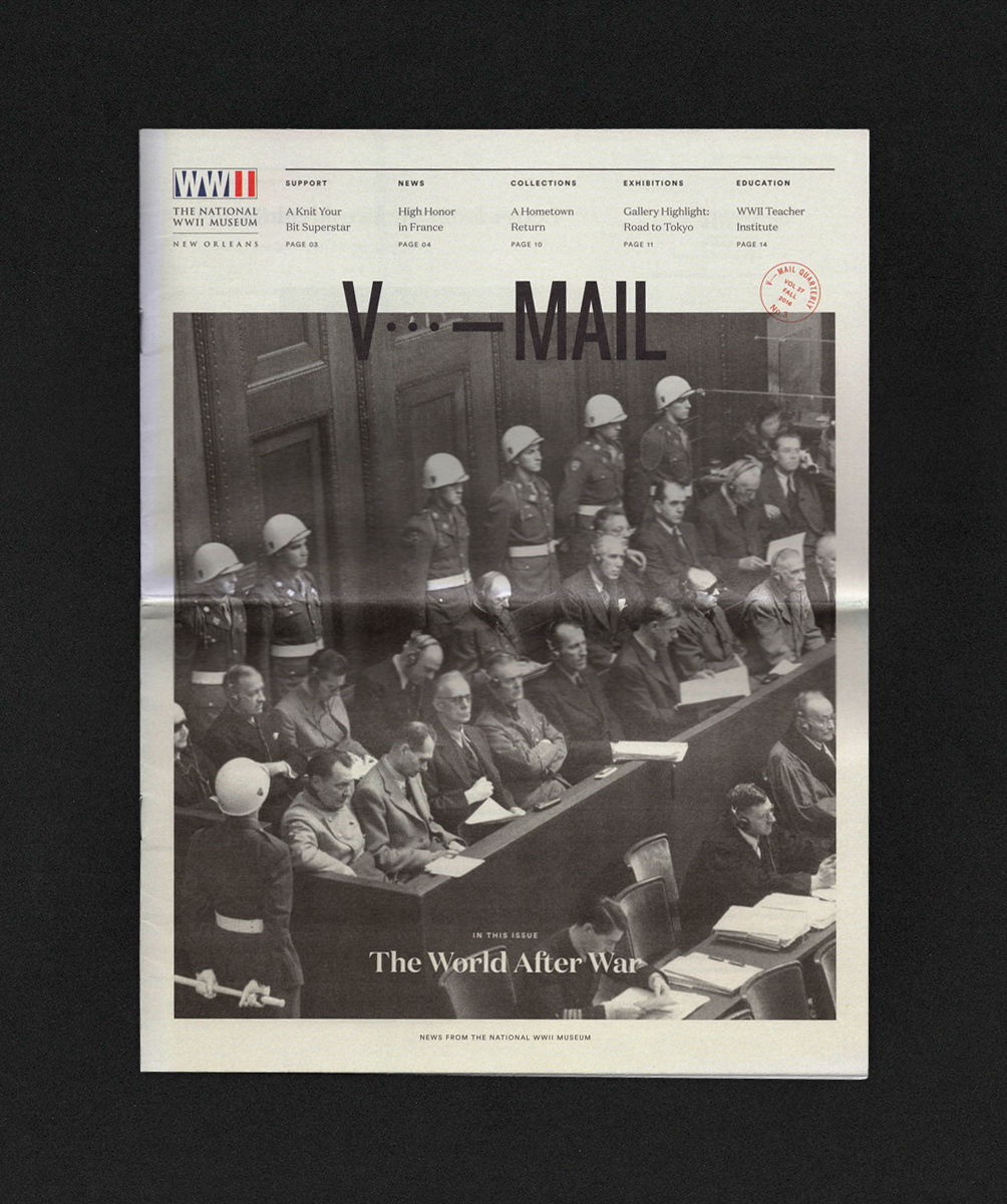
The rebranding, not only of the aesthetics of the sixteen page newsletter, was the name, V-Mail [short for Victory], itself. Historically, V-Mail was hybrid correspondence mail that attempted to streamline communication between the troops and their loved one. Many typographic solutions were visually thrown around on propaganda posters during the war but none were an official logo, so to speak. It seemed fitting to reference these somehow, along with ‘V’ in morse code alongside it.
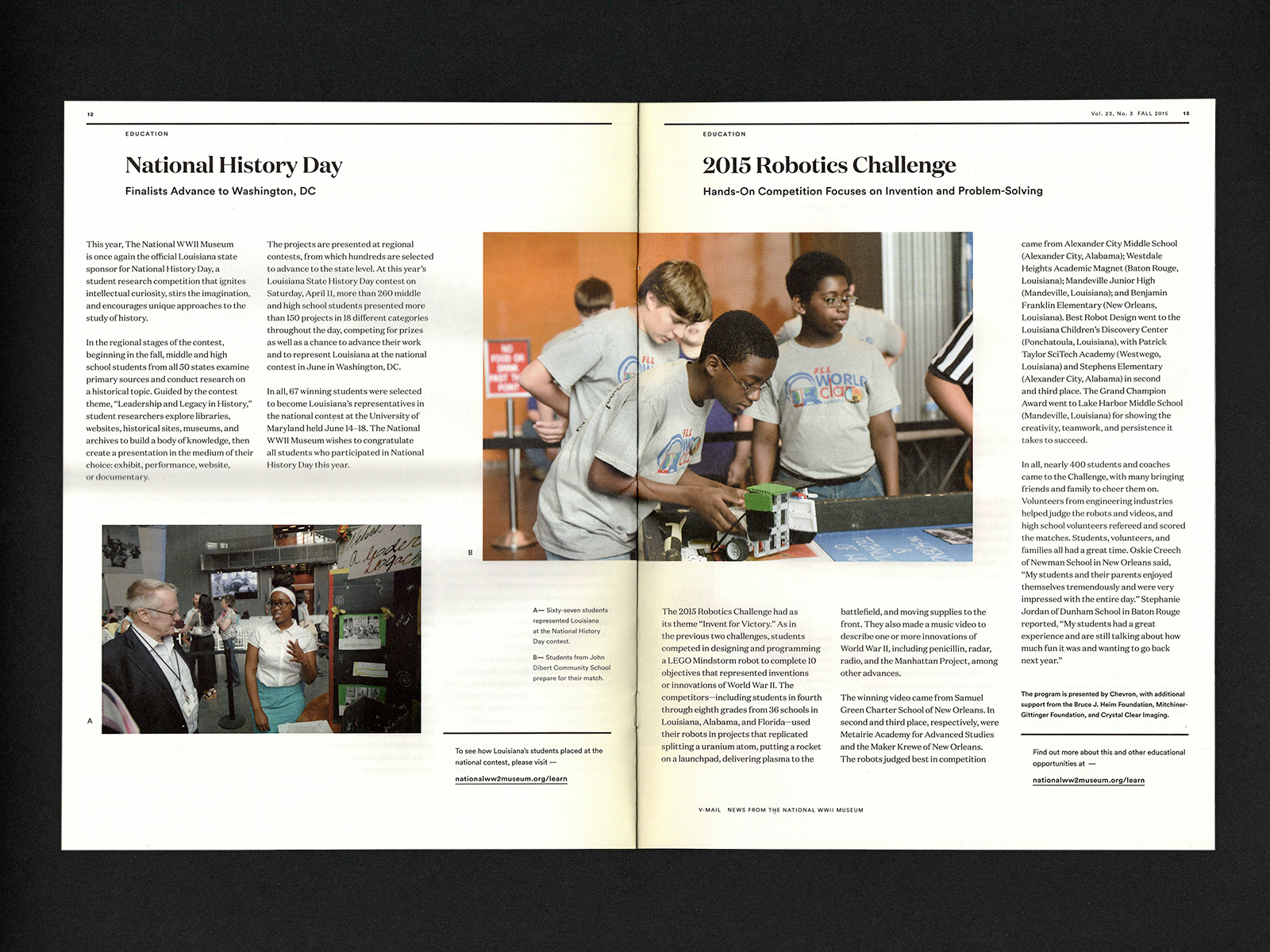
I think the strongest asset of working on these publications over the years, is the access to archival photography from this period. The strength of the images do much of the heavy lifting, elevating it from the look of ‘newsletter’ and into something of more weighty consequence.
The conservative design layout has slowly evolved for different needs over the years, so it is nice to be a continued part of this process, for both the museum and I.


Logo mark created for the V-Mail Newsletter, with Volume Postage