Branding for our friends and their European artist/research residency program that was based here in New Orleans over the years. Its application across posters, zines, artist books and self-published works, helped solidify a blending of our collective imaginations.

Client: Deltaworkers
Research-based International Artist Residency
New Orleans, LA
The design challenge was to combine the name Deltaworkers, in a non-traditional way, referencing not only dutch-typography, but combining it with imagery that could be separated from the type itself. My proposal referenced the triangular elements of the ‘deltawerken’, an important dam/spillway in the Netherlands, since both geographies share an on-going struggle with water.
The modularity of the logotype and its implementation into various printed matter made for an instantly recognizable, but oddly branded communication throughout its years of programming.

Deltaworkers Bars Identity

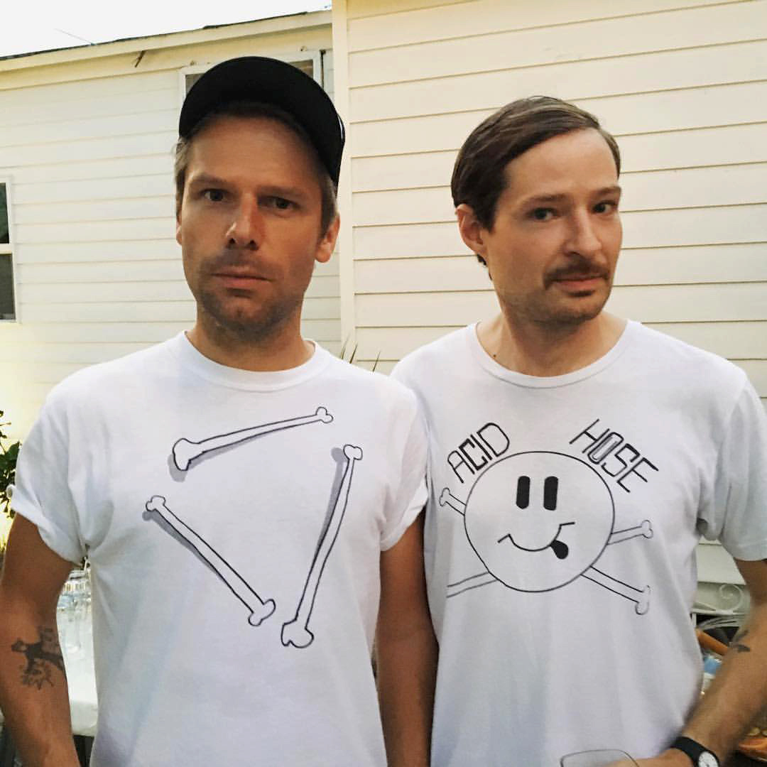
Deltaworkers Acid Bones Identity