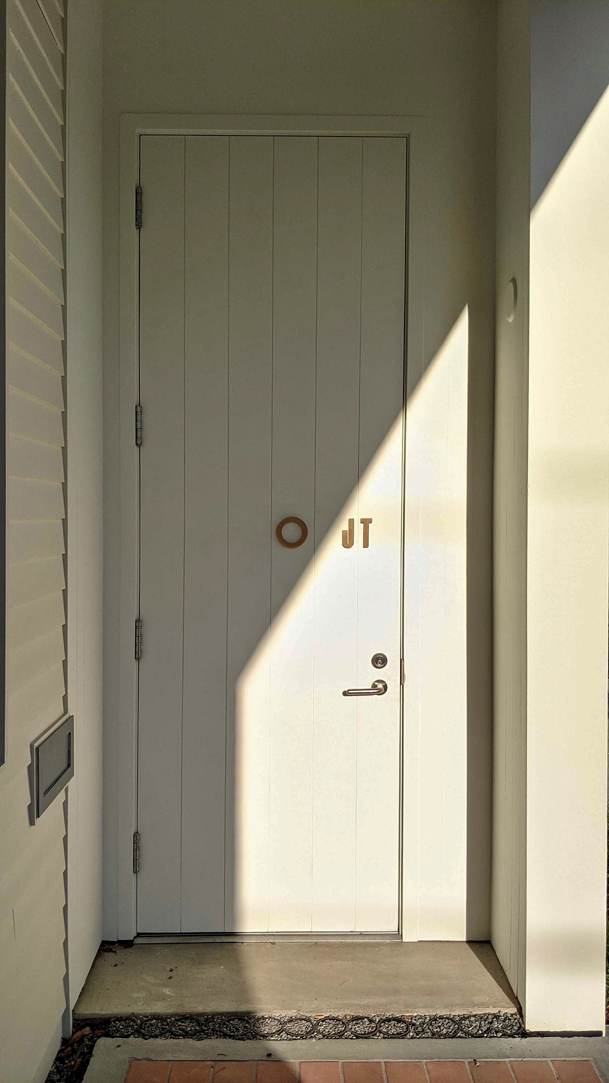
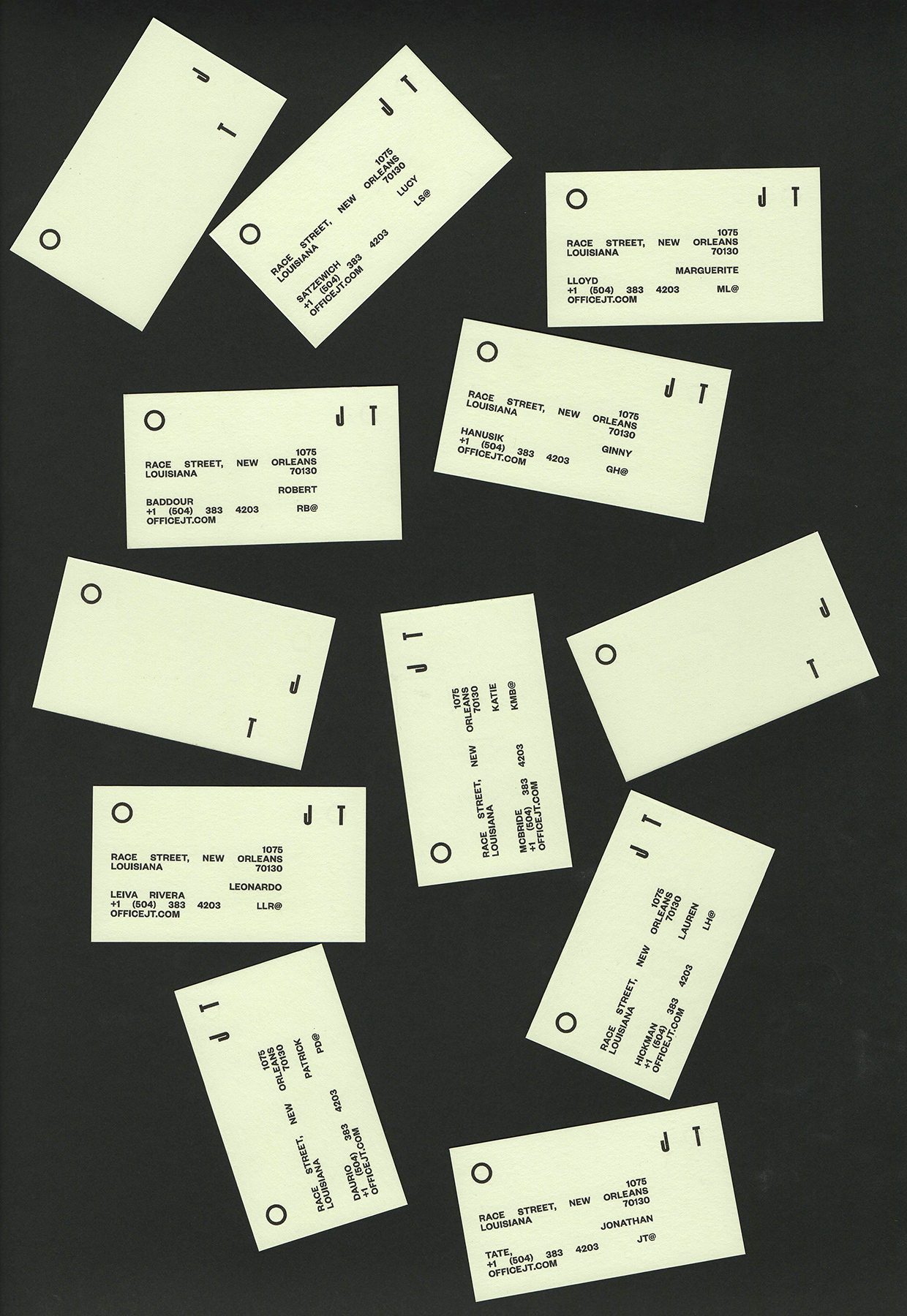
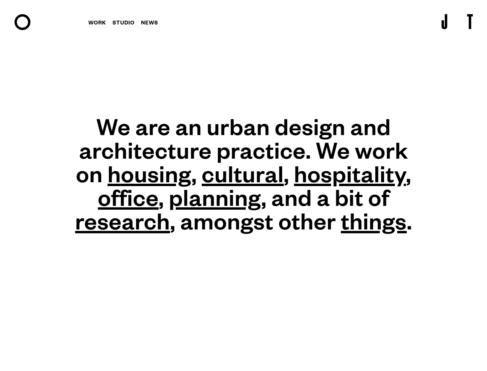
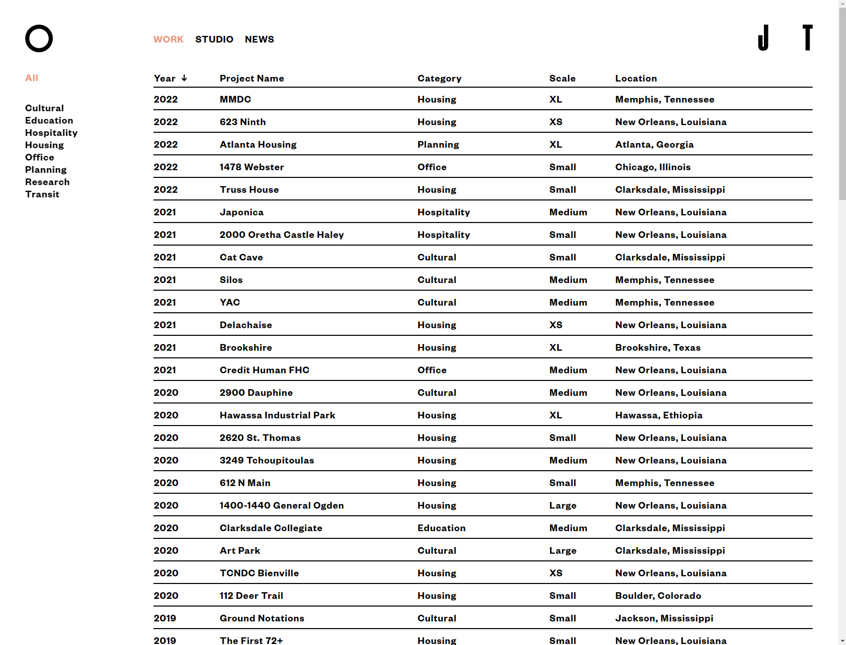
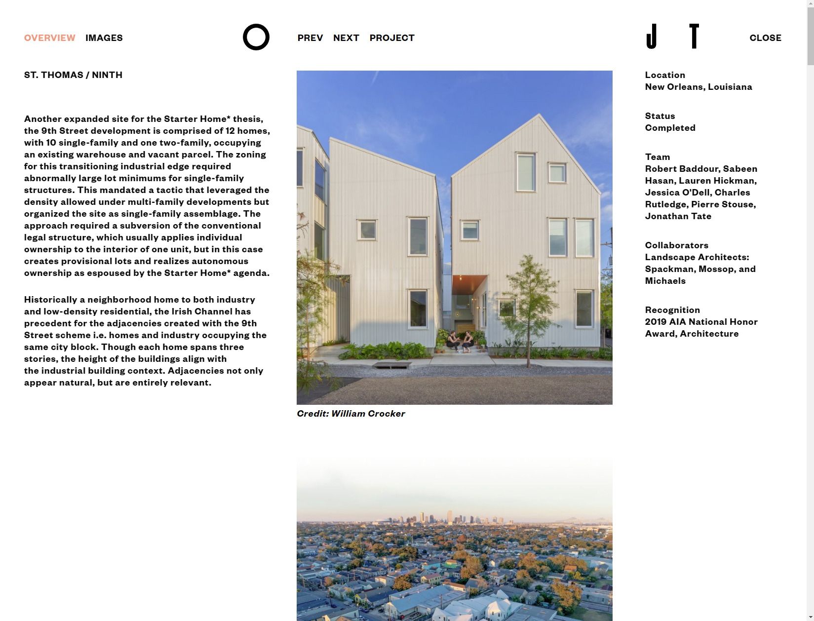
A re-imagining of the previous O J T identity into something a bit more contemporary in terms of type treatment, without going too far from the its initial simplicity of communicating: ‘The Office of Jonathan Tate’ without spelling it out.
Client: Office of Jonathan Tate
Architecture Firm
New Orleans, LA
officejt.com
Site Development:
Joris Lindhout
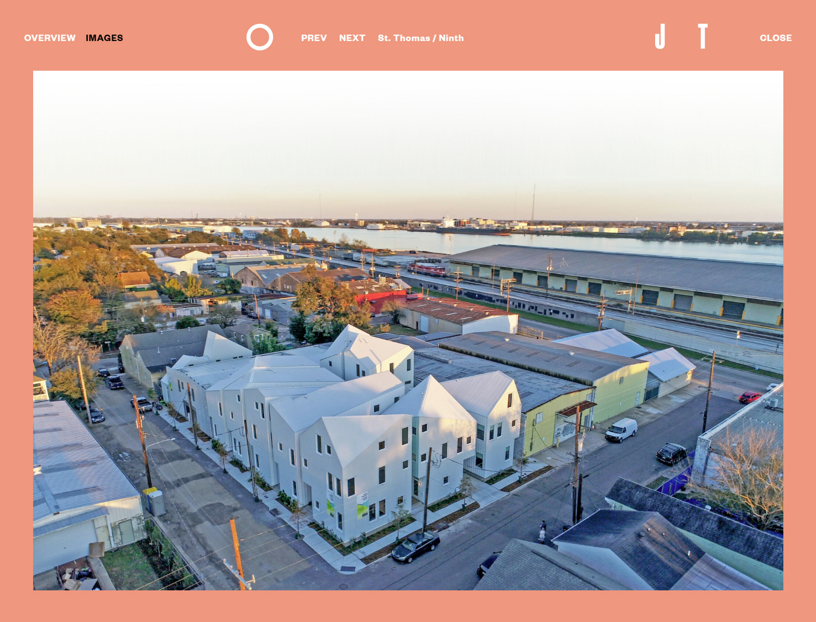
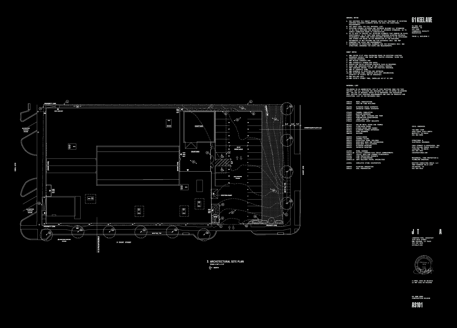
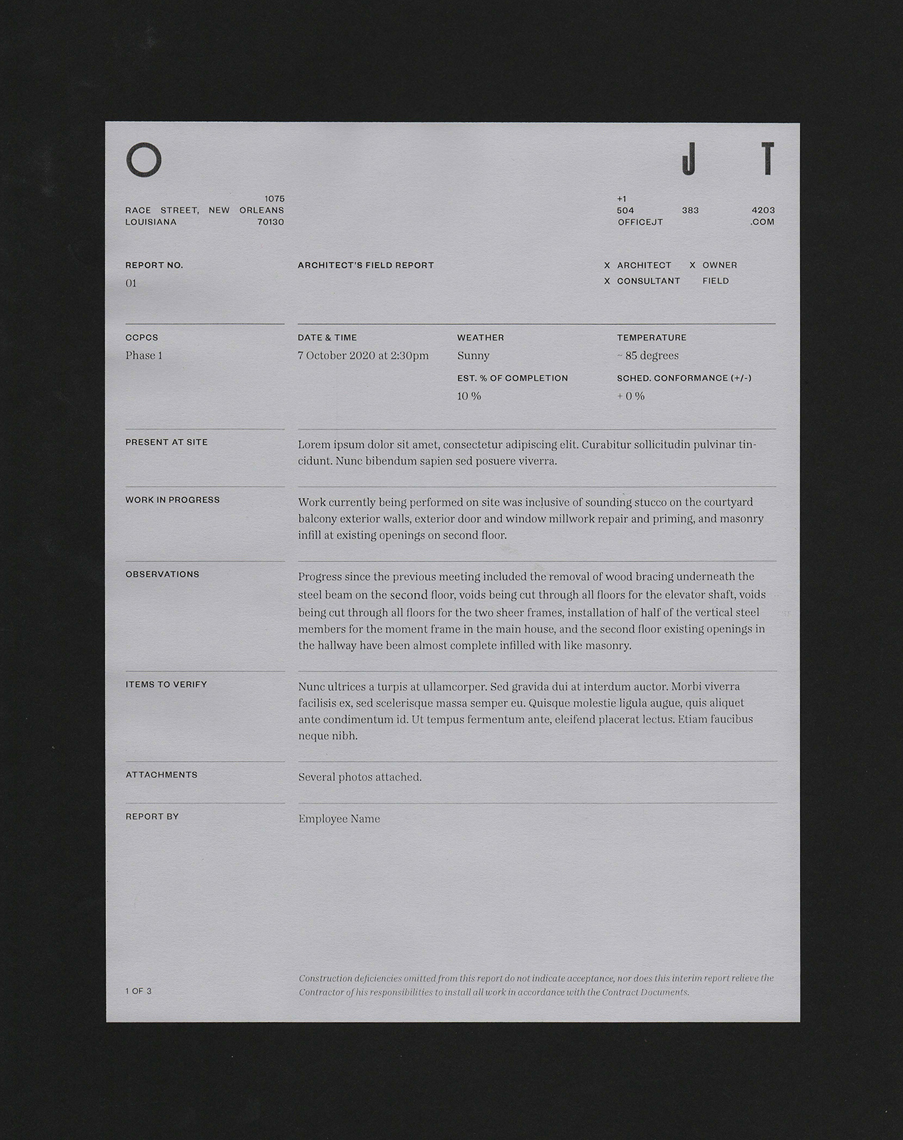
The thinking behind the update was to find a bit of playfulness in varying widths and spans across different surfaces, along with the typical information that is to be included to fulfill required information about the firm itself. Nothing ground-breaking in this case, but creating a modular form and accompanying type to be used within the blueprints and architectural plans proved a larger task than initially thought. The team was open to a bit of experimentation without having to go off the deep-end of clear messaging within the communications collateral. In the end, we were able to generate documents that can be produced in-house by their team, easily and efficiently, yet retain a certain flair.
The firm’s work definitely leads as the most forward-thinking in New Orleans, so it was an honor to be able to work with them on their re-imagining.

J T A Variable Width Identity

J T A Variable Width Identity

O J T Variable Width Identity


J T A Variable Width Identity
