Understanding Manon Bellet’s artistic visions and following her output over the years has solidified a deep understanding of her work with text is translated onto the printed page or within the exhibition space. Below are a number of projects we have collaborated on together.

Artist: Manon Bellet, 2022
Risograph poster
A3
Risograph edition of 300
Print produced in Lausanne.
This is the French version of the set of interview excerpts that accompanied an exhibition at Ferme Asile in Switzerland. The page contained excepts from an audio interview that gave the listeners context and they could follow along with on the headset provided.
In general, we work quite seamlessly together and I am happy with the results of the simplicity and graphic interest that the text built upon the page, even if sparse.


Artist: Manon Bellet, 2021
Poster
11 x 17 in.
Risograph edition of 70
Print produced in-house
These posters needed to perform two functions: interview information and image to display when the interview had been consumed. It gave the viewer a context, the transcription, something about the artist and background information of the residency in which it derived.
In general, we work quite seamlessly together and I am happy with the results of the simplicity and graphic interest that the text built upon the page.


Artist: Manon Bellet
Typesetting for installation and bottle
Developing the type style for her olfactory work, whether on a mirror a product label, was a straightforward one. Her direction of nothing too fussy, experimental, or possibly too Swiss [her home], informed a clear approach to much of the expectations of what was to result. There needed to be a certain simplicity that did not compete with its surroundings, but maintain a definite sense of clarity and sensuality.

Bottle label for the scent edition, 2017


Tester / Scent card for the special edition perfume, 2017.

Artist: Manon Bellet, 2019
Label for packaging
Risograph edition of 40
Print produced in-house
Packaging design isn’t my strong point, as it could be the anti-marketing mentality that I carry deep within me. However, it is interesting to think about how elements can be applied to objects—in what they can become or how they are then read.
Studio in the Woods had a fundraiser and had Manon develop a scent from the forest in which the residency is located. Working within budgets, Manon found these boxes and vials, while I provided the wrapped label. The residency filled them with Spanish moss and wax sealed them for finish. It was a nice exquisite corpse with everyone adding elements to the product.


Card-wrap label of the special edition perfume for Studio in the Woods, 2019.

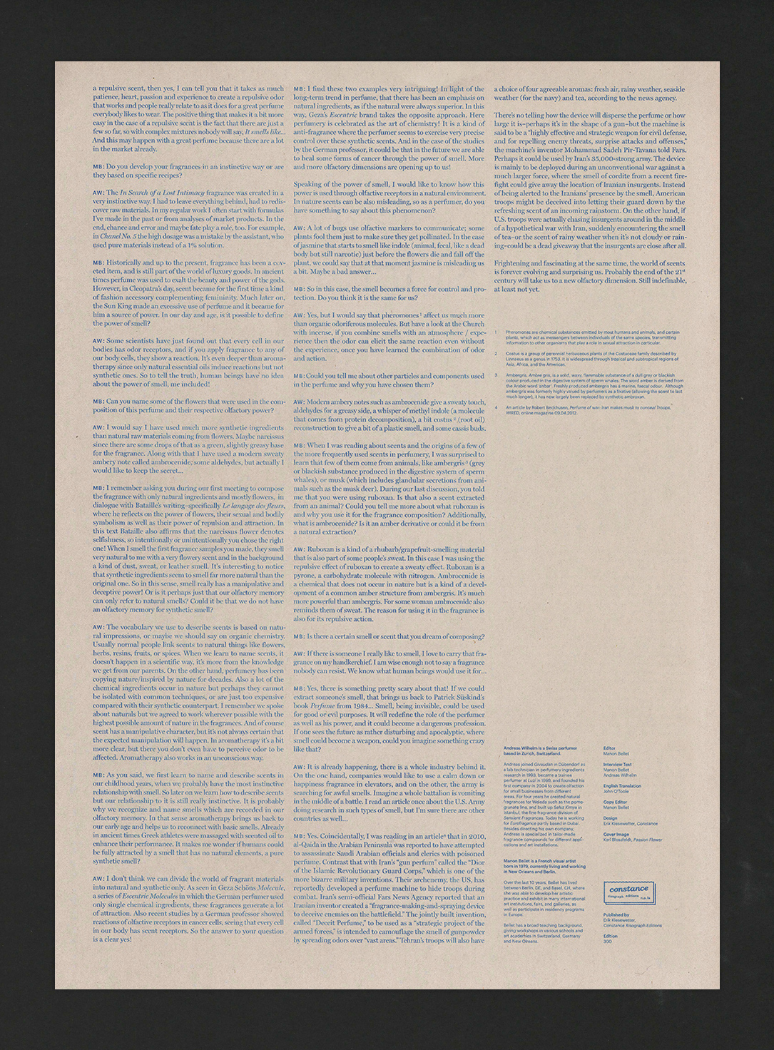
Artist: Manon Bellet, 2016
Newsprint poster
12 x 18
Risograph edition of 300
Print produced in-house
This is the English version of the interview that accompanied an exhibition in New Orleans. The page contained a lengthy interview that needed to be maintain a classic, straightforward feel, still act as an object that one would retain after reading, yet produced on a lean budget, and quickly. The dreaded unattainable triangle: cheap, fast and good.