Having zero product design experience, I was tasked to develop a number of packaging concepts for New Orleans coffee roaster, Congregation. Over the years this grew into a larger set of work that meandered into marketing and varying printed ephemera to solidify their visual aesthetics beyond the typical coffee competitor.

Client: Congregation Coffee Roasters
Various Packaging / Product Design / Ephemera
Packaging production in US & China
Label / Sleeves printed in New Orleans
Risograph printing in-house where applicable
I was initially surprised by the inquiry to work on such a project that spanned many years and concentrated mostly on packaging. However, Eliot of Congregation Coffee insisted the odd fit would bring a fresh set of eyes to the project and ultimately it was his interest in my ability to understand and reduce the amount of hand-work they were spending on the DIY nature of graphic styles and information spread across many types of label systems they had previously deployed. We had to find ways of creating a more stream-lined modular color and type system that can scale to various products—even ones I didn’t know were to exist yet.
It has been a true honor to have been part of this type of product development: to see it on the shelves, to witness his roastery operations expand, and see his staff grow, and have his visions fulfilled.

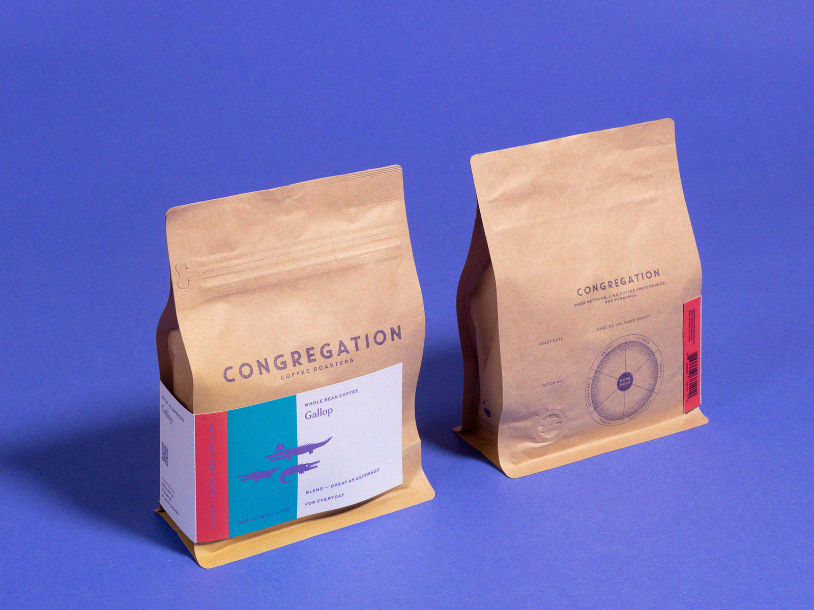
2018 / 19—
Horizontal Gusset Bag and Label System
Various Dimensions
Bag Packaging produced in China
Sticker label produced in New Orleans
The initial packaging had to work in a multiple of ways. First, the horizontal nature of the packaging was a chance to explore and step away from the other vertically-designed brands on the shelf. The bag needed to also work without a labeling system for commercial and/or one-off packaging. It was printed on kraft with purple and a sunflower / marigold to give the bag a slight glow.
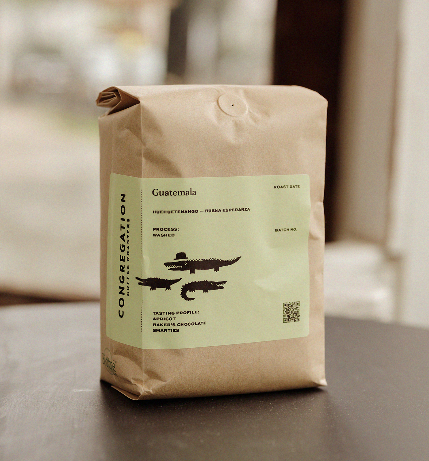
The label systems were developed after the color way was created and its purpose was to not only compliment the bag color itself, but to contain all pertinent information of origin, weight, taste profiles, among other call-outs. Additionally, label utilized a perforated tear-away along the gusset which contained the taste profiles and QR for easy re-ordering, once the package had been discarded.


Basic Horizontal Bag that could exist without a label system.


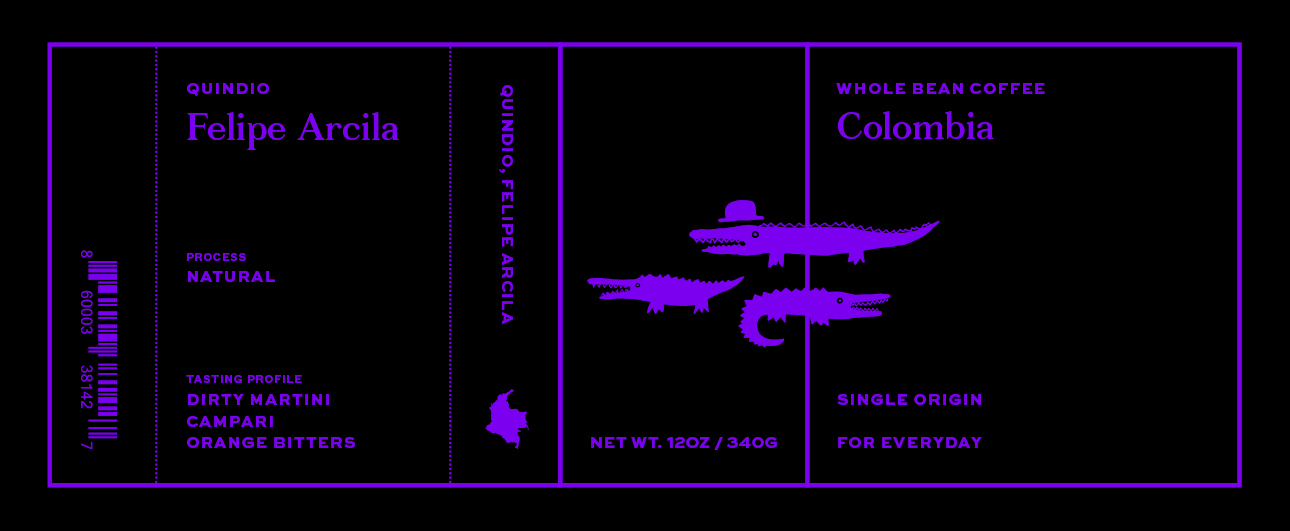
Sticker indicating roast, farm, origin, process, tasting profile, weight, optional QR, and UPC
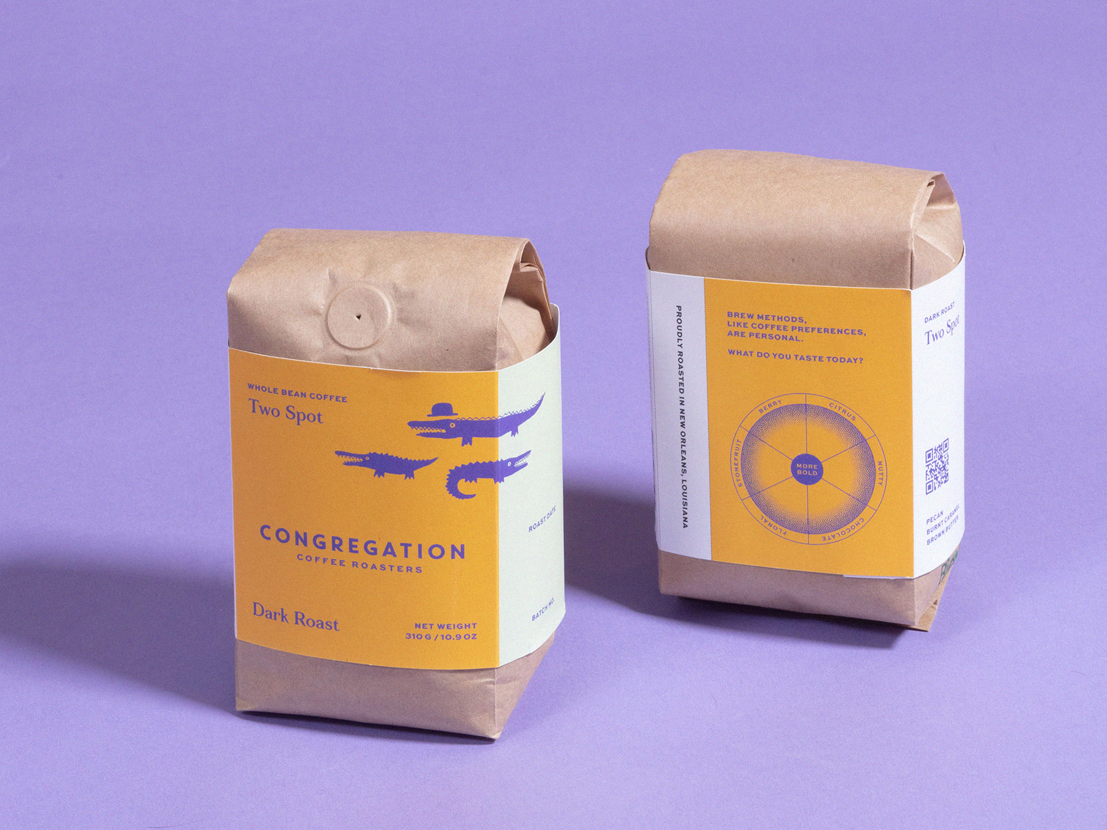
2020 / 21—
Sleeve Label System
Various Dimensions
Sleeve Label produced in New Orleans
As one would expect, there were supply-chain issues during the pandemic after we had developed and printed an initial set of the aforementioned horizontal bags. This gave way to us relenting to the typical vertical bag, but attempt to more deeply explore a label that would continue the previously set look and feel, in hopes to set itself apart from the competitor’s packaging.
The proportions allowed us more breathing room for design, as well as reduce cost by creating wrapped bands that could be more easily reproduced and applied.
There are currently nine colorway / stripe variations that showcase the roasted blends and seasonal single origin beans.
An additional thermal printed label was created to produce labels quickly and in lower quantity for commercial orders. These are produced on-site via a Rollo Printer.


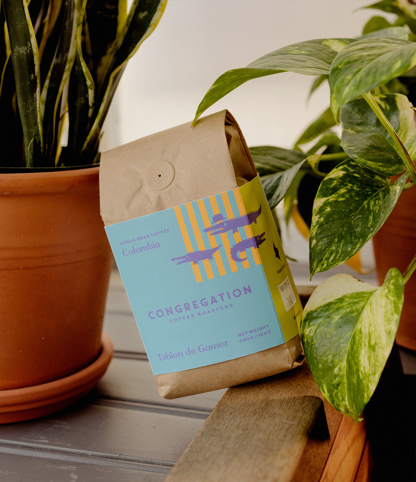

Label sleeve indicating roast, farm, origin, process, tasting profile, weight, optional QR, and UPC



2021 / 22—
Cold Brew ‘Franzia’ Box
7 x 4.5 x 9 inches
1 Gallon
Cardboard box printed in the US
After a few years and culmination of the set design elements, it felt right to expand into something that is ‘design adjacent’ to the set style. Eliot wanted to get a cold brew ‘space bag’ style product into the grocery store freezer and it had to again, feel a bit different from the typical offerings that were to share the same shelf.
The vertical bar line system was developed here initially and later applied to the special edition single origin label systems. Keeping within the set type, alligator system, as well as reduced color way, I am super proud of how the package came out and how open Eliot was to having something non-trendy, but also somewhat odd looking to be printed in mass.


Cold Brew Box

2022—
Special Holiday Gift Box
Edition of 300
8 x 6.5 x 3.25 inches
Collage artwork: Cubs the Poet
Cardboard tray and inset printed in the US
Sleeve printed in New Orleans
Thermal Labels printed onsite / on-demand
Risograph poster produced in-house
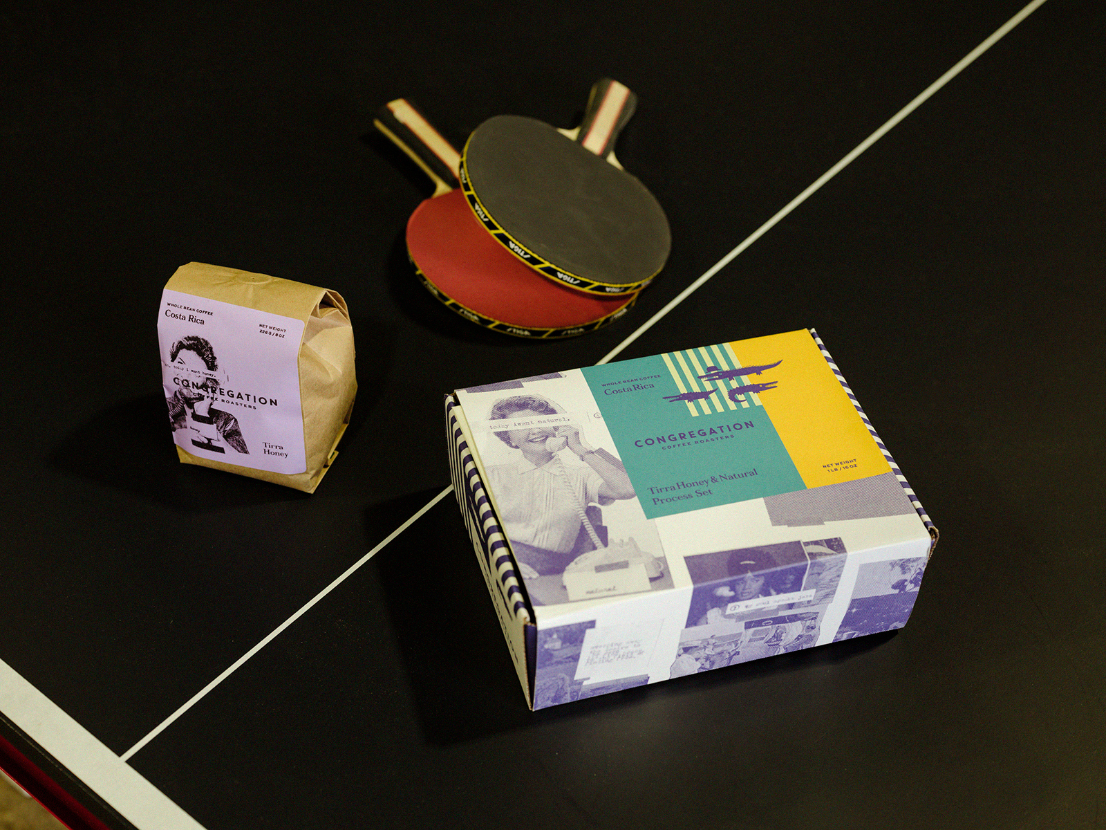
Combining the set label design system, we had a chance to utilize custom artwork from local poet, Cubs the Poet, to create this special edition holiday box containing two seasonal coffees. With a truncated timeline and set calendar holiday date, I think we were able to produce a package that felt special, inside and out, despite the short timeline.
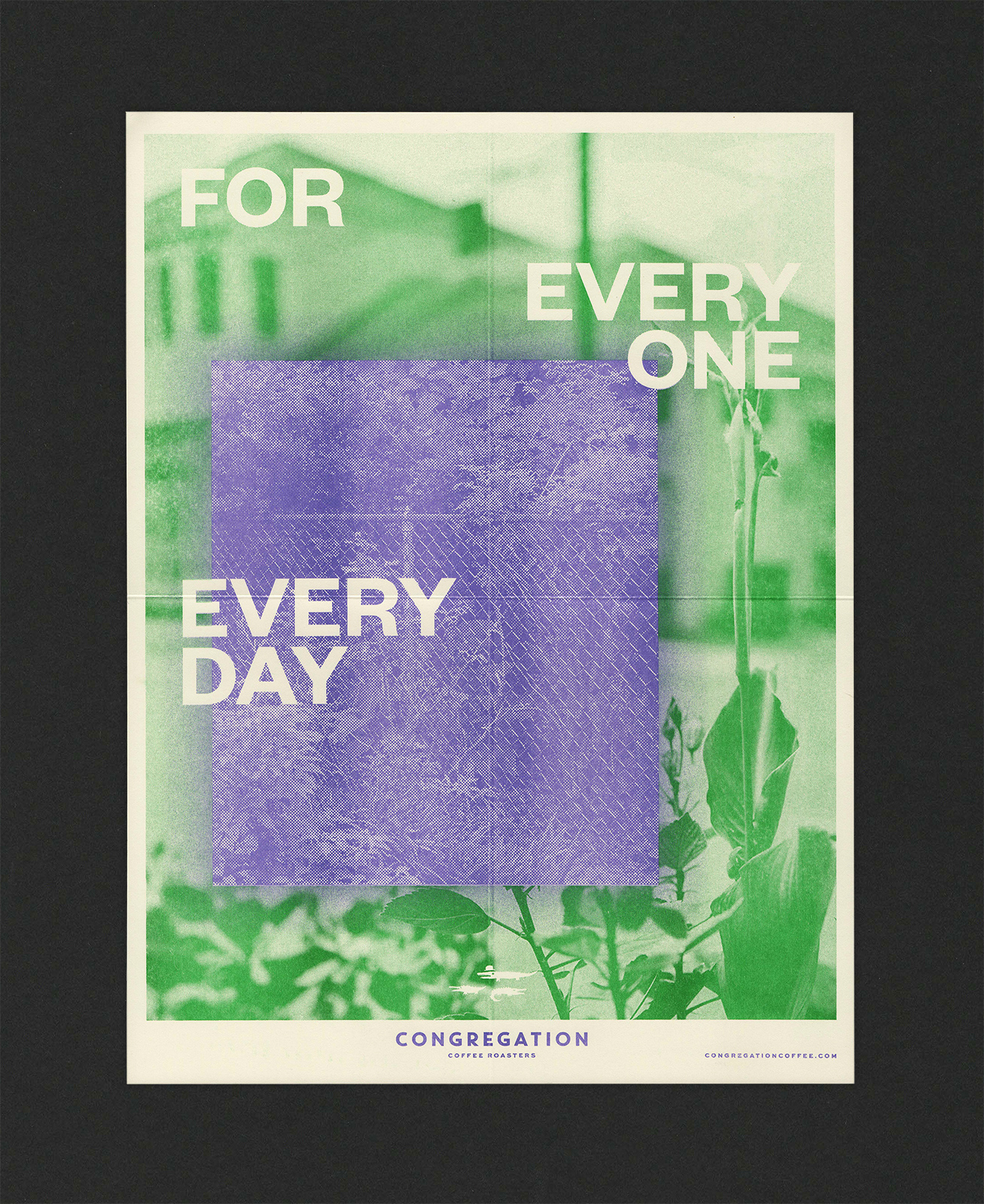
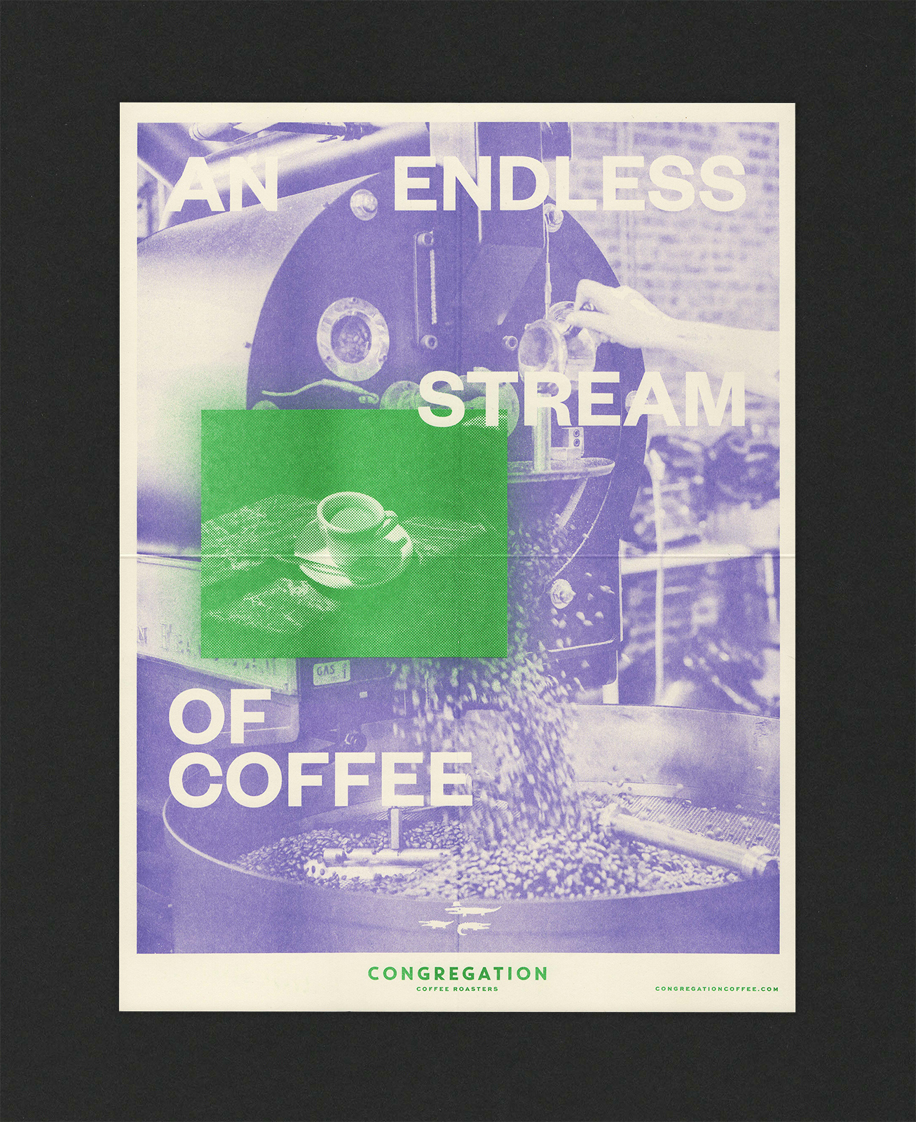
I provided print preparation and production of the Risograph quarter-fold poster that was to be included within the package. This felt like an easy and quick piece that gave the packaging ‘an extra’ for it to stand out a bit and feel like a true gift box.
Additionally, the coffee bag labels utilized our on-demand style of thermal printing, so we were able to keep everything within the holiday production timeline.


2022 / 23—
Poster / Pamphlet and Online Marketing
Various Dimensions
In collaboration with Between Projects
Marketing Director: Jonah Langenbeck
Director of Photography: Jac Currie
Photography: Giancarlo D’Agostaro
As Congregation grew, I introduced Eliot to long-time collaborator and friend, Jonah Langenbeck, who assembled a team of us under the moniker ‘Between Projects’ that executed a marketing campaign, online and offline for a range of products and subscription services that the roastery offers.
With many years of marketing experience for cultural institutions and businesses, Jonah called upon Jac Currie [ Defend New Orleans ] and I to concept the look and feel of the initial campaigns. While trying to not go too Southern Gothic as I tend towards, we invited photographer Giancarlo D’Agostaro to capture the beautiful decay in the surroundings of the cafe, while avoiding too much of the generic lifestyle photography that thoughtlessly pervades most contemporary businesses these days. It is a fine line, but the authenticity of the cafe, the roastery and the neighborhood only were to compliment an already perfectly made product.
The majority of the campaign contained online marketing ads which eventually were rolled into a sales package that could be mailed to possible clients, cafes, restaurants, hotels, et al. The package included a quarter-fold sales sheet / poster that contained information about Congregation and a visual treatment on the reverse. Information cards of the taste profiles of the offered coffees were packaged as well. These items were designed and printed in-house via our Risograph studio.


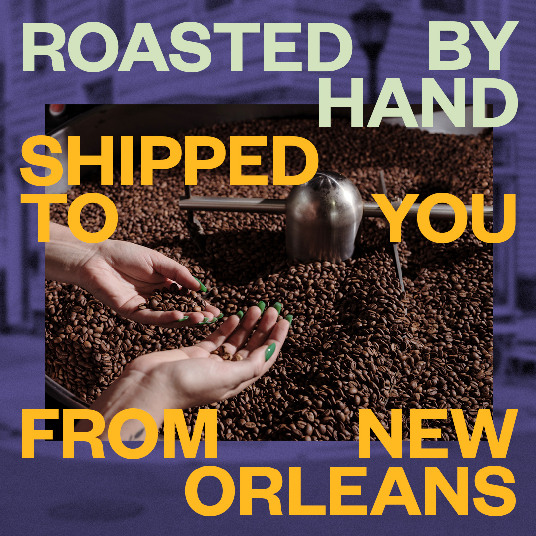

Evergreen Campaign


Online Campaign

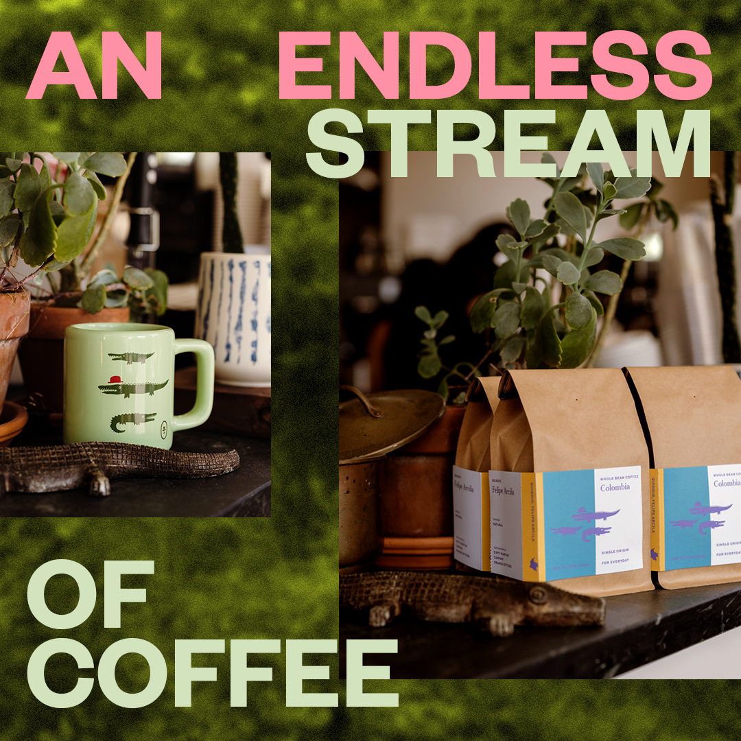
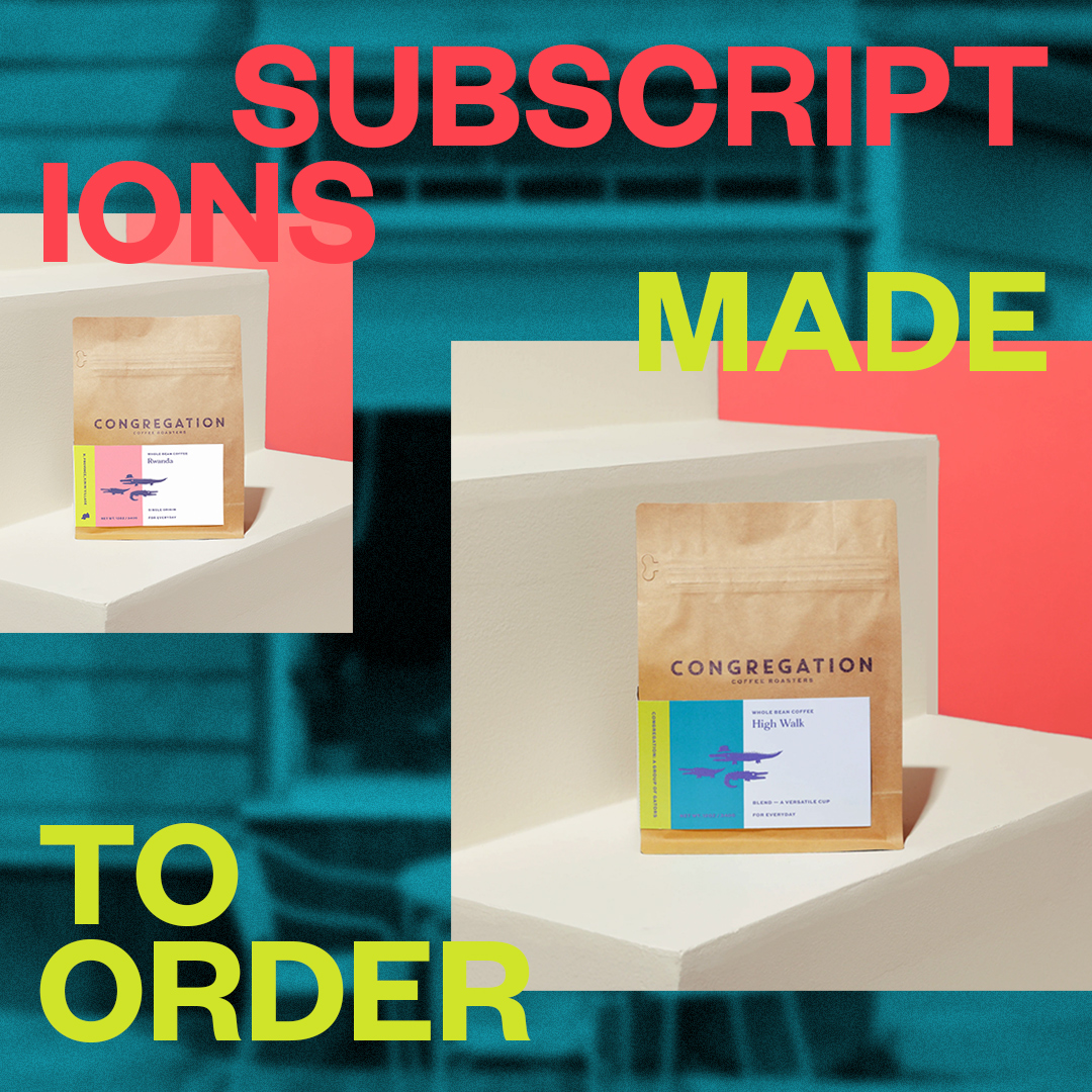

Subscription Campaign


