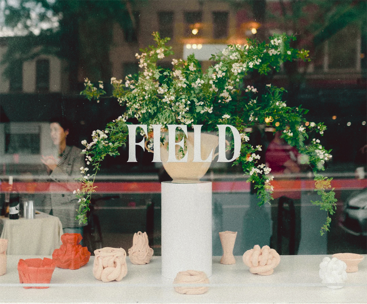
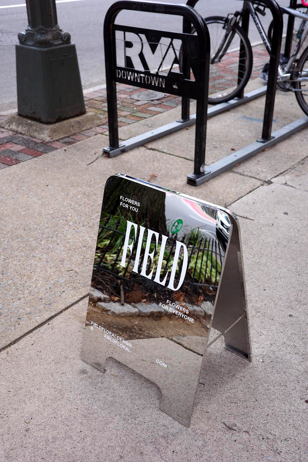
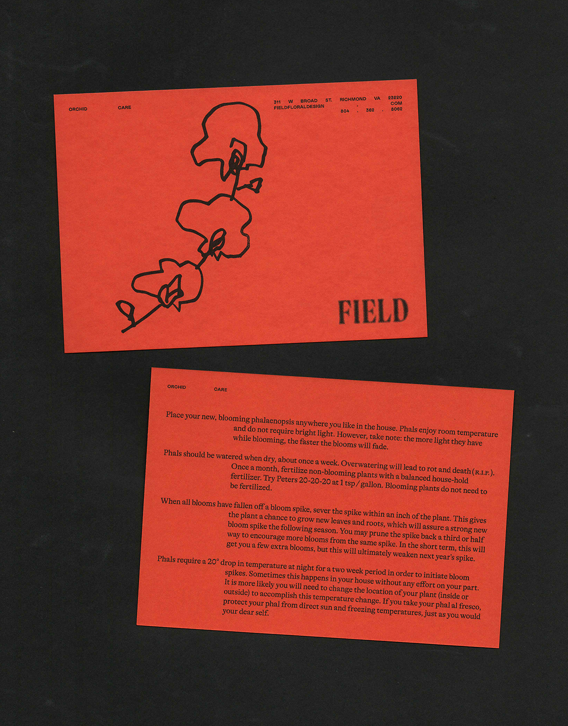
In attempts to avoid the ‘millennial Matisse,’ Lee Matalone and I investigated a certain elegant, but naive brutalism in attempts to capture her typographic vision.
Client: FIELD
Floral Stylist
New Orleans, LA
This was a simple exploration that required no-overthinking and was maintained through a straight-to-the-point back and forth with a person who knew exactly what they wanted. The experience allowed for a mutual trust in each other’s forwardness, resulting in a visual playfulness and clarity that I would like to continue investigating alongside her vision when the time is right.
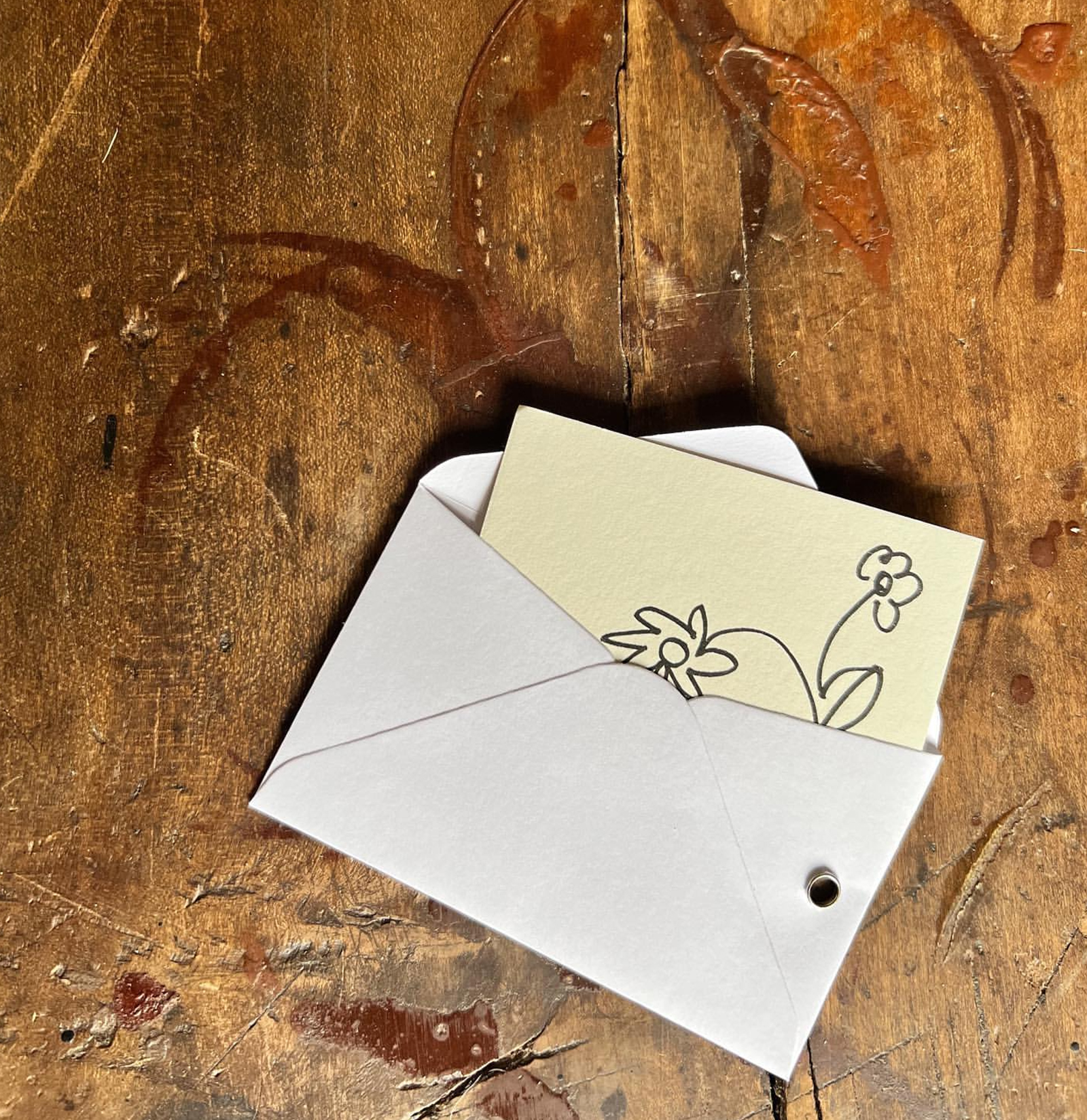
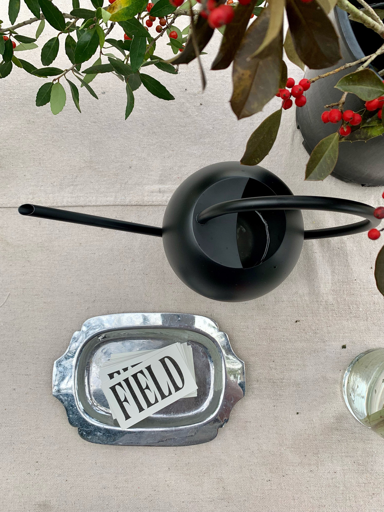
Ultimately, we landed on vertically stretched type treatment the name cards, utilizing the card as container for the type. Felt right.
Non-stretched logotype for the floral stylist
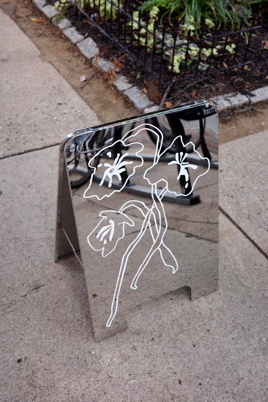

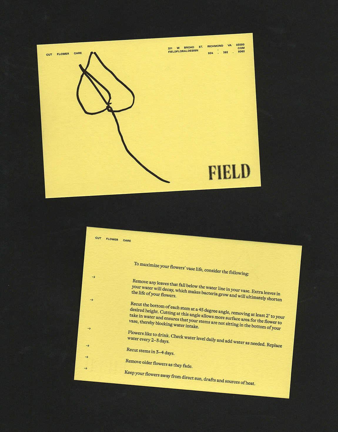
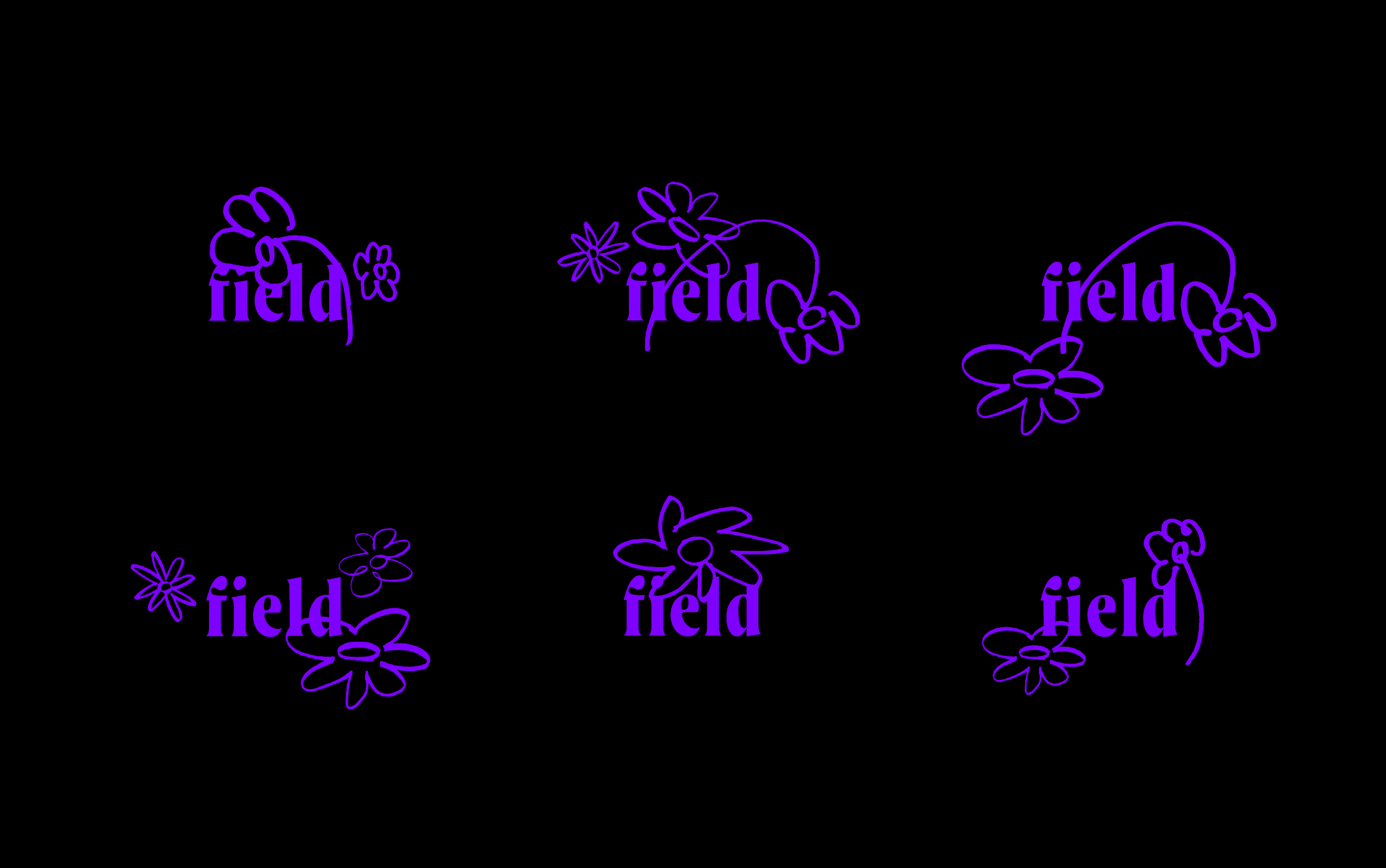
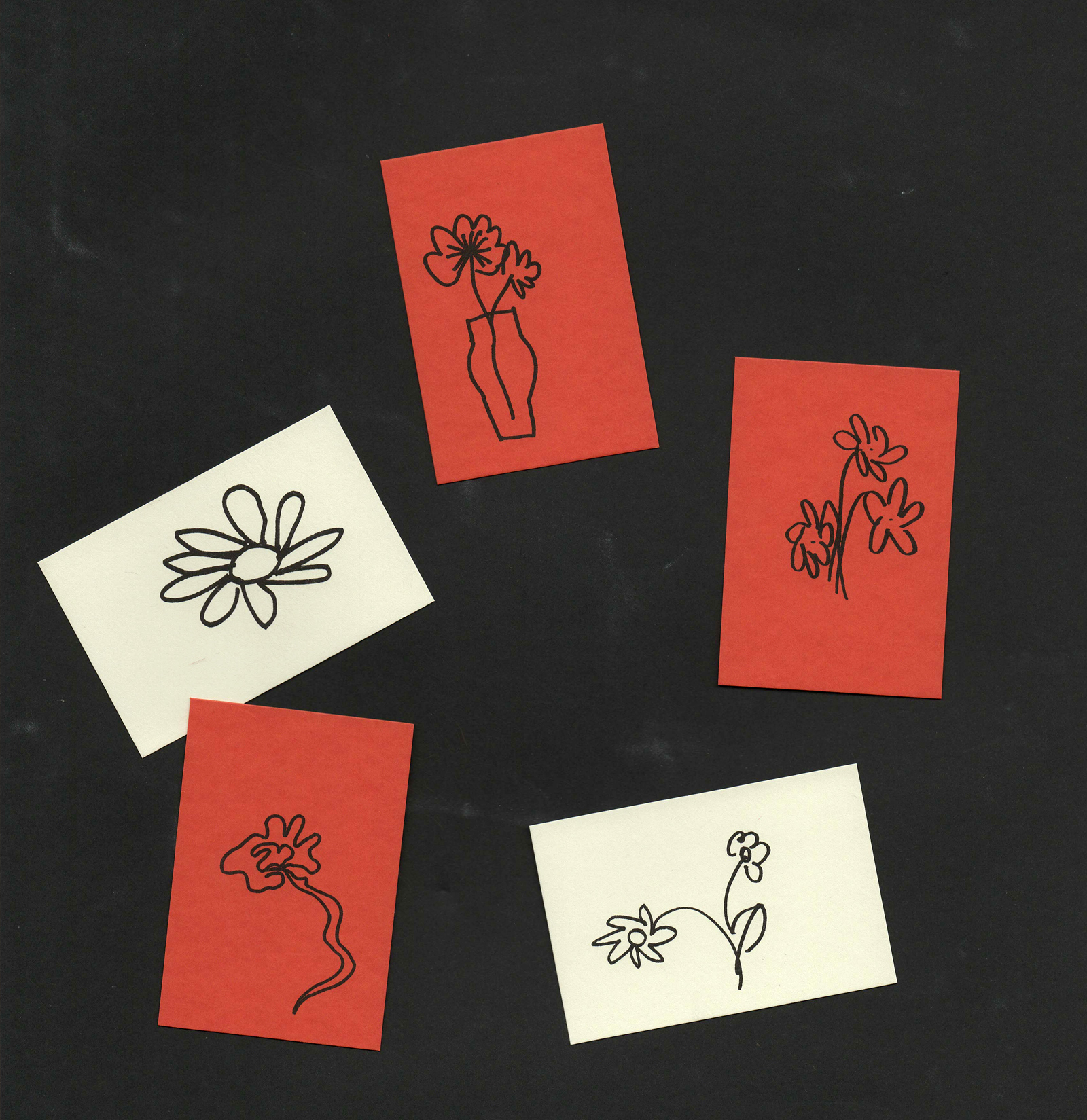
Other [un]successful attempts in a lowercase type exploration