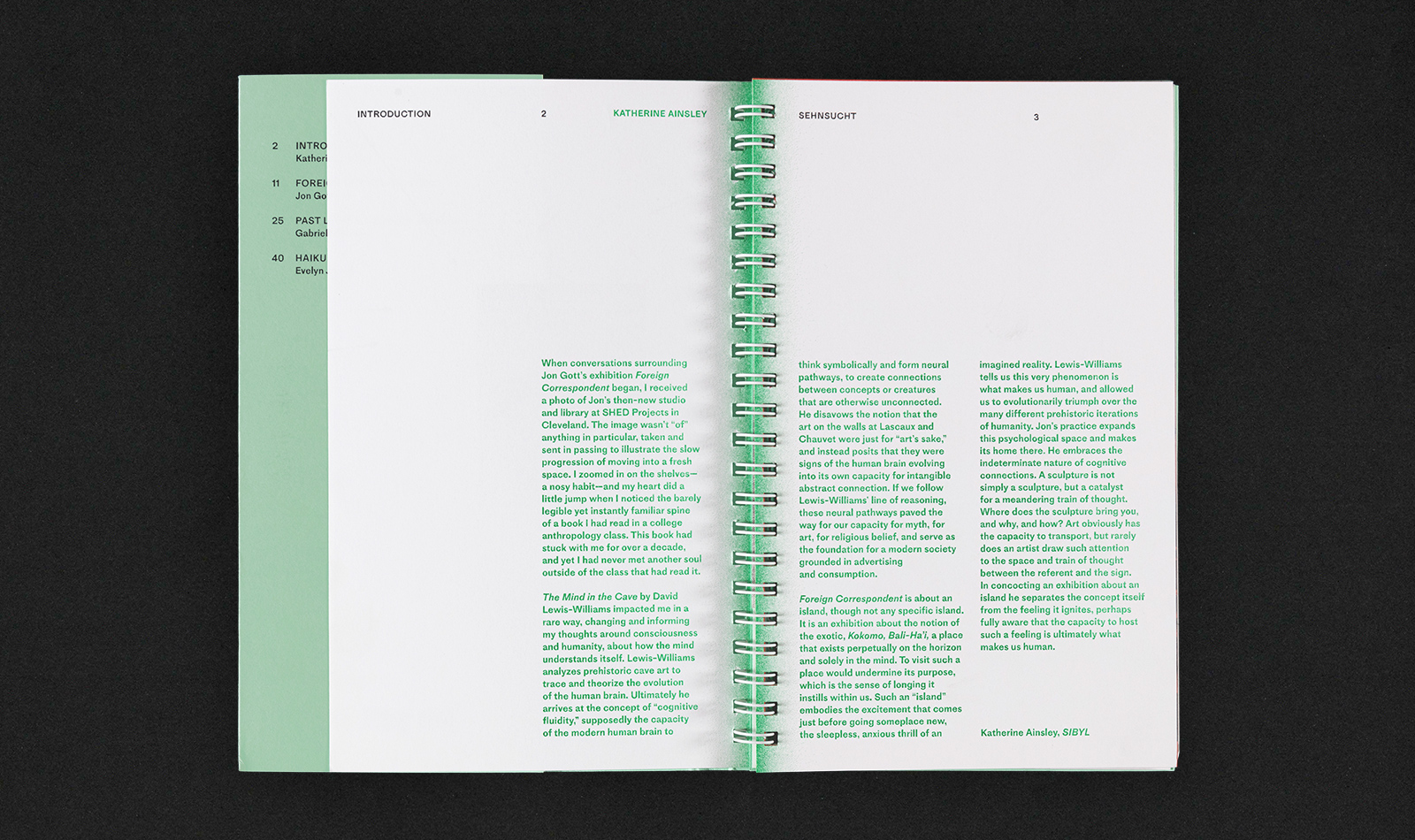
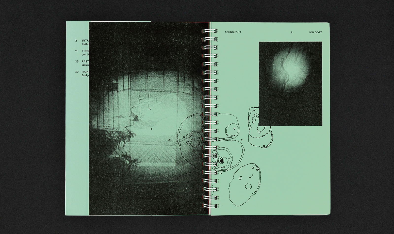
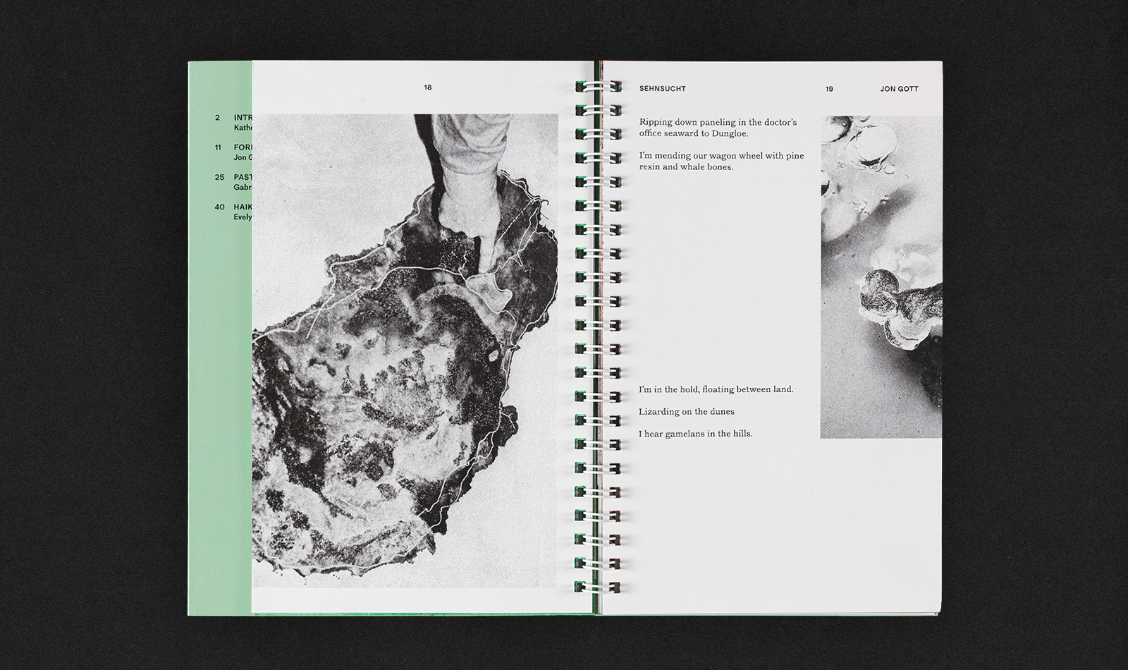
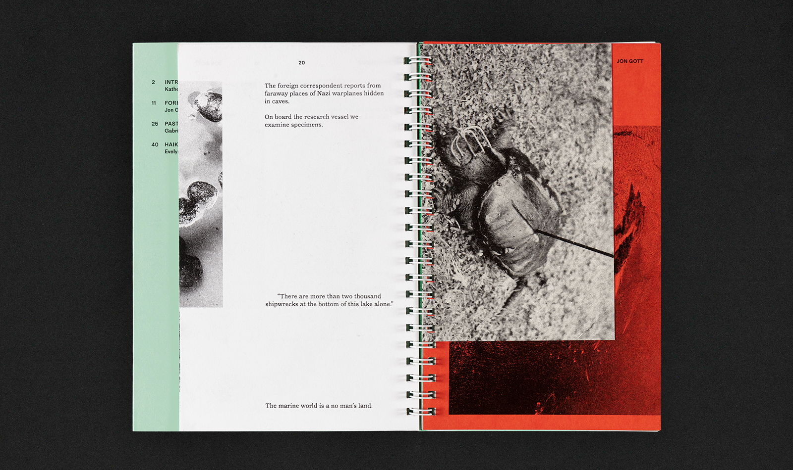
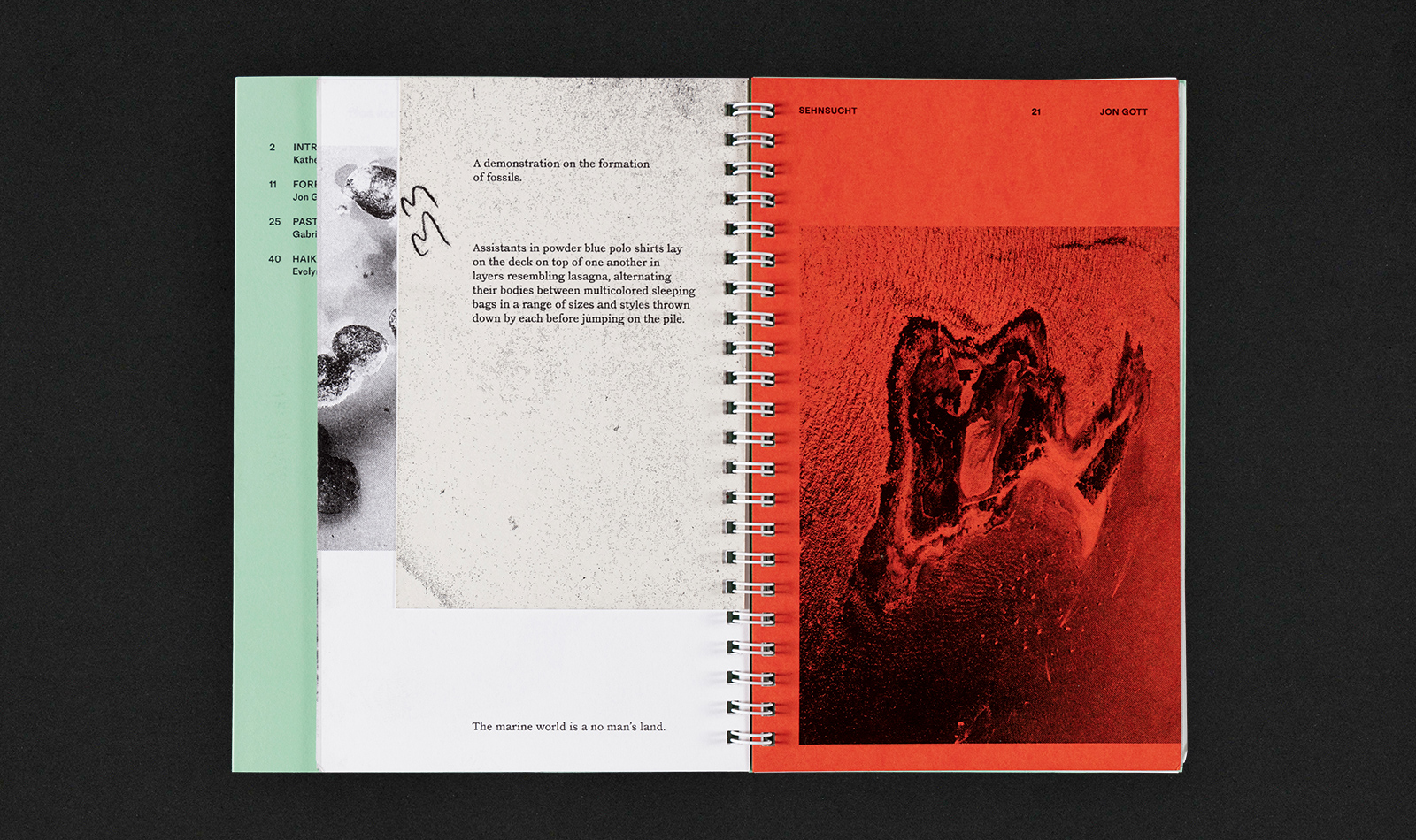
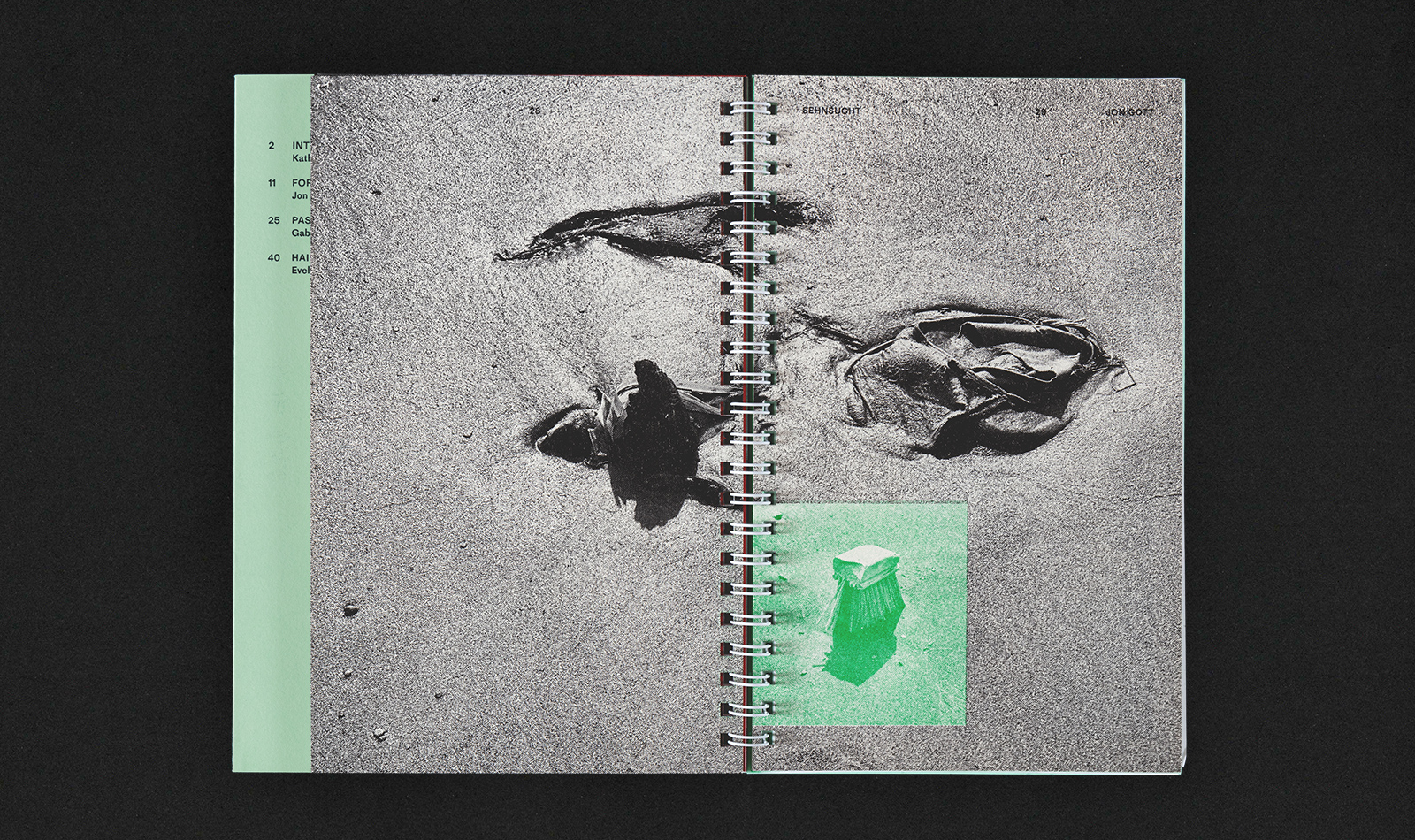
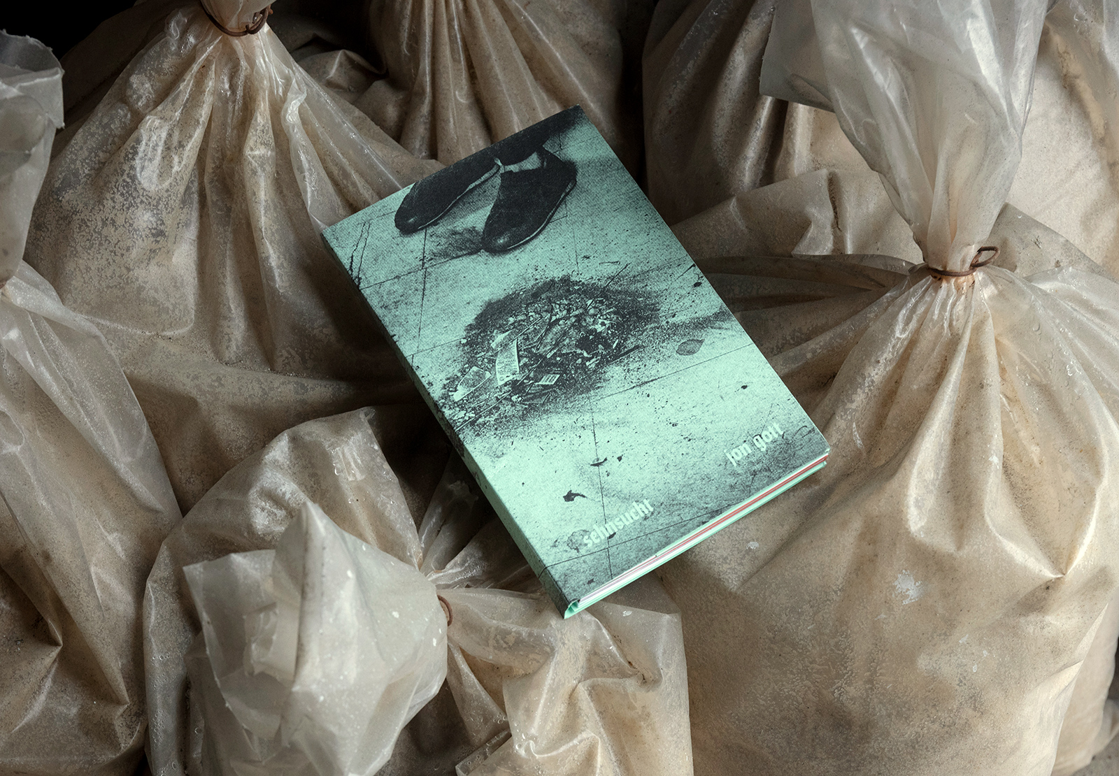
These dream-like connections of the false conscious that we employ during times of longing or ‘sehnsucht,’ allowed us to create meandering flashes of memory and misremembrance through the complex manufactured imagery of artist Jon Gott. A total ‘dream’ for me personally was having this rare opportunity to create narrative, utilizing image and text, and contextualizing it into an artist publication that works as a piece, itself.
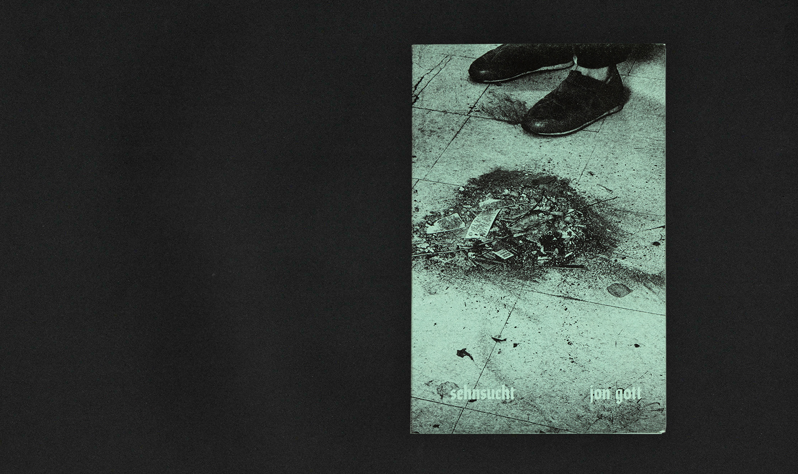
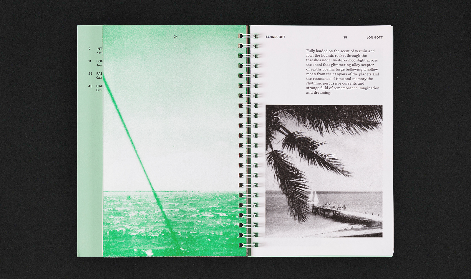
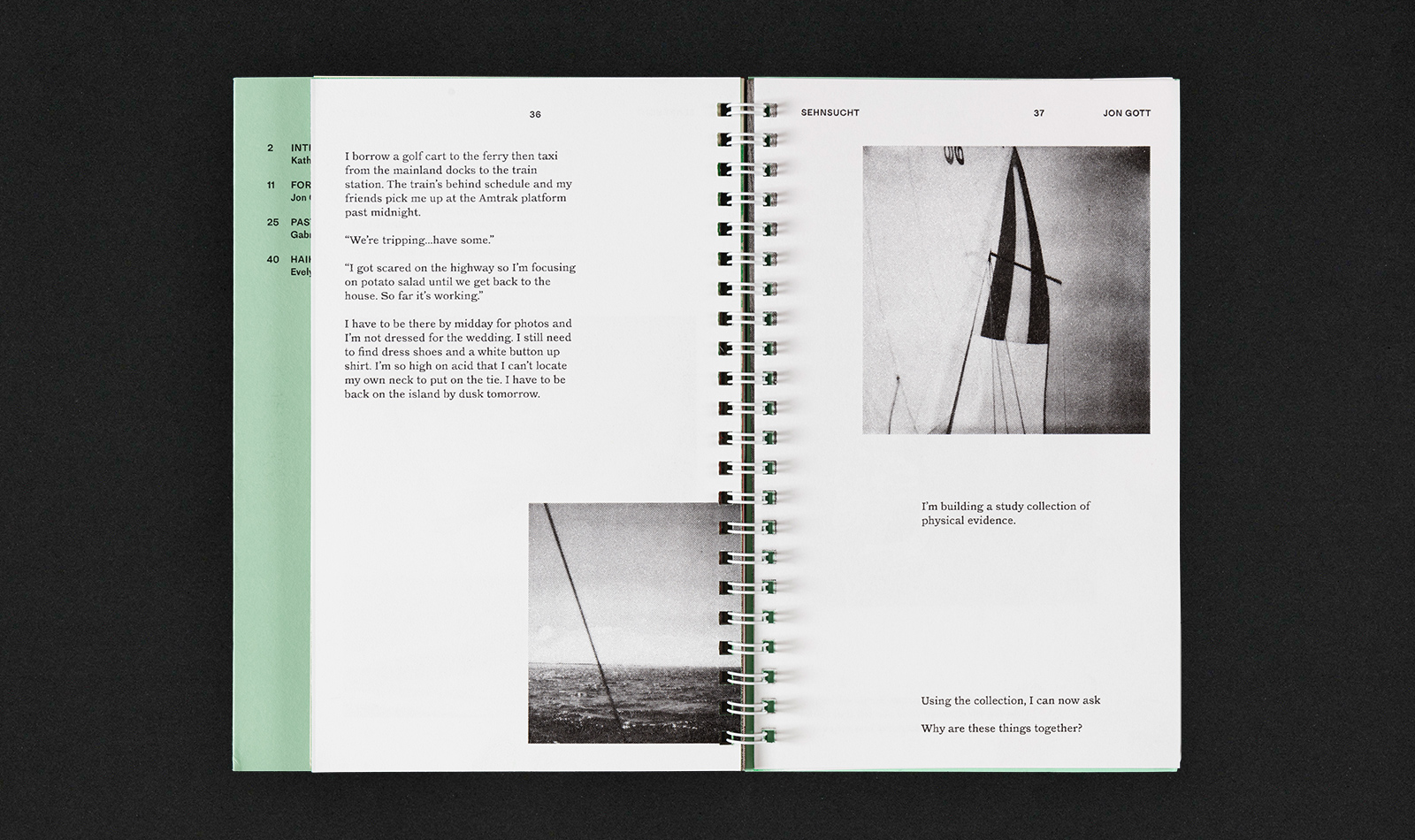
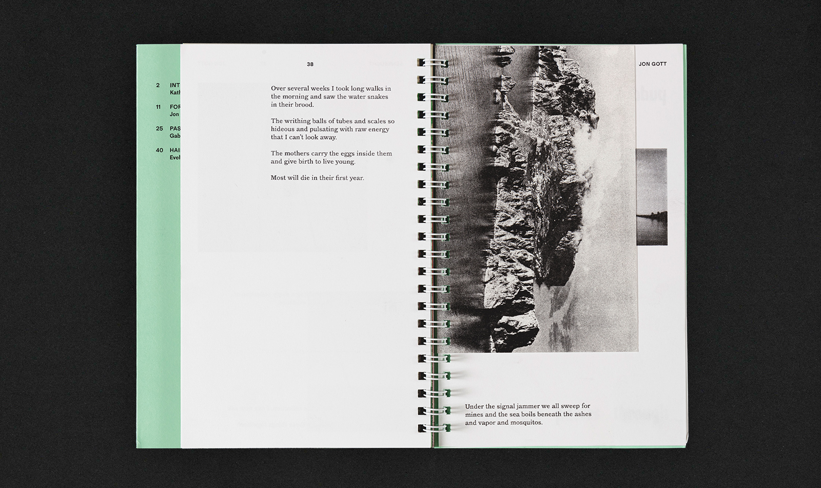
Artist: Jon Gott
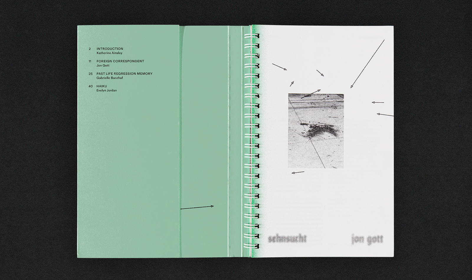
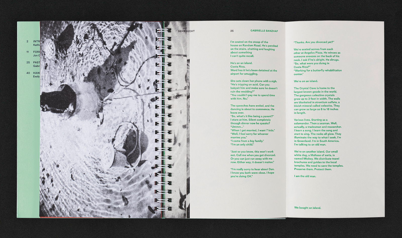
Texts: Katherine Ainsley, Gabrielle Banzhaf
Haiku: Evelyn Jordan
jongott.com
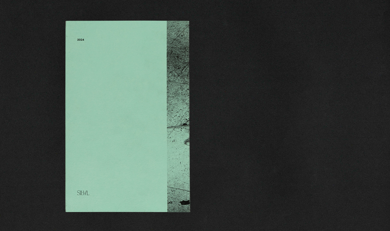
44 Pages
5 x 7.75 in.
Tri-fold Insets
Wire-bound
Various Paperstock
Edition of 50
Risograph Print and Assembly in-house
Working on a conceptual publication can go a number of ways, design-wise. Maybe the design idea element becomes too obtuse for the viewer or can simply stall the design process internally, working with the artist in question in attempts to find the right path of design communication.
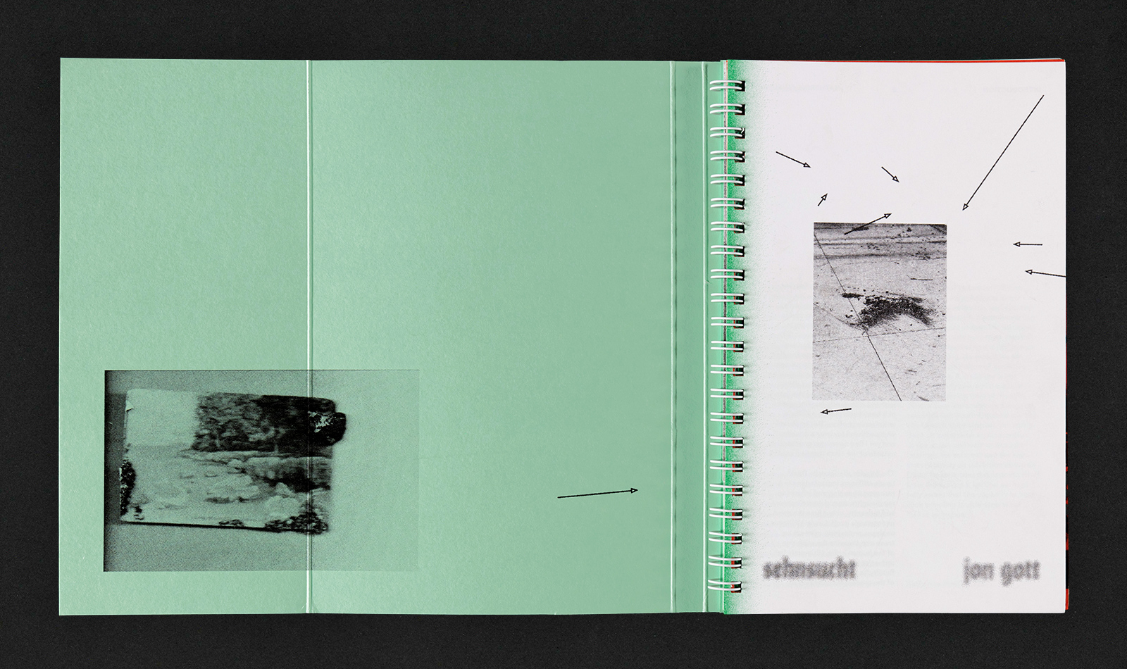
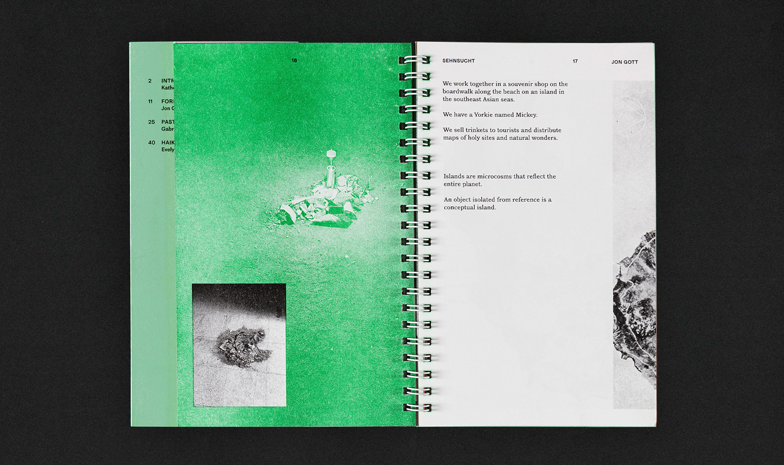
The publication was set in the dimension of a travel journal of sorts, with loose spiral binding combining a number of paper stocks, weights and colorways. By limiting the risograph printing to two-colors, black and green in this case, the exploration of paper types was key to ensure variation and tactility throughout.
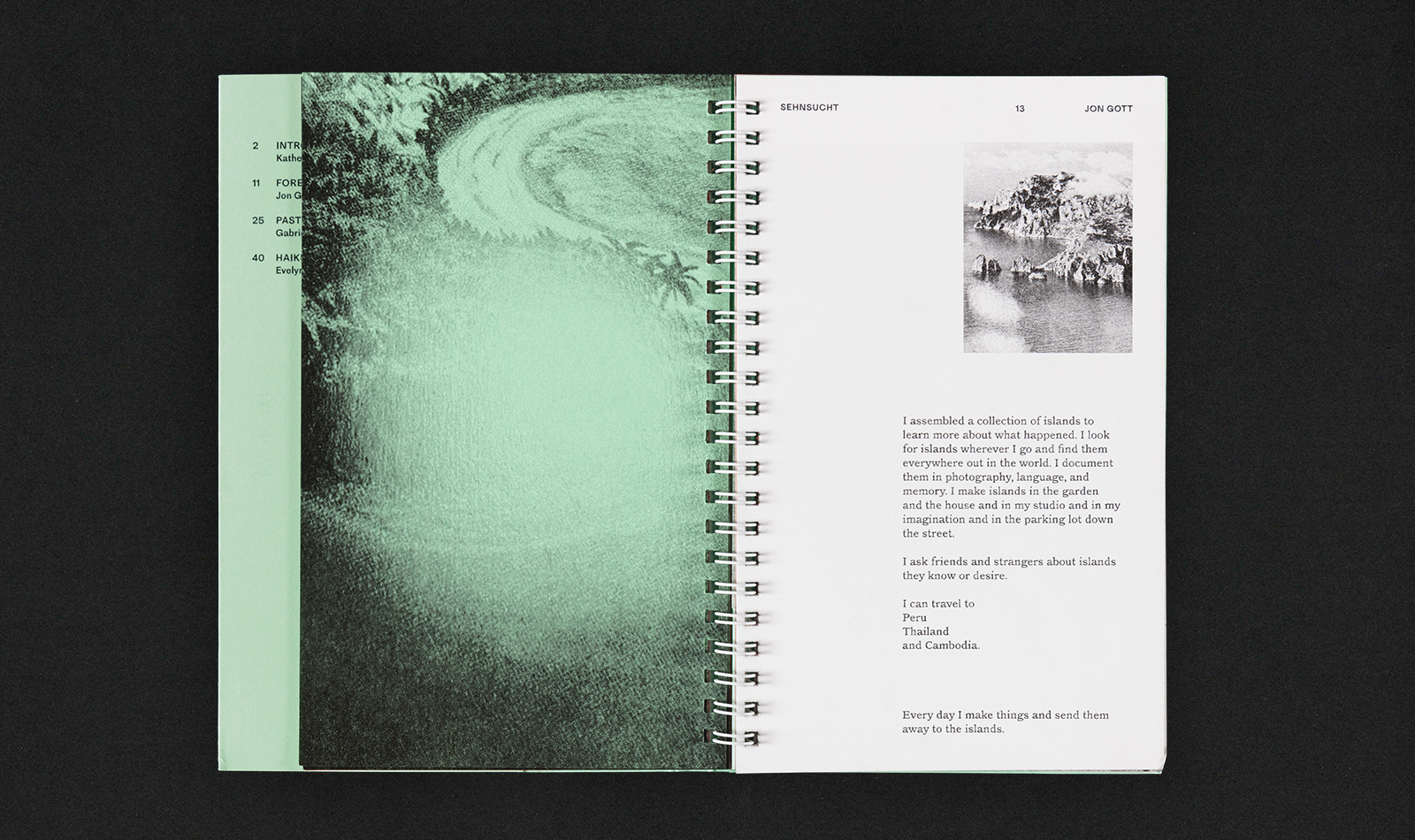
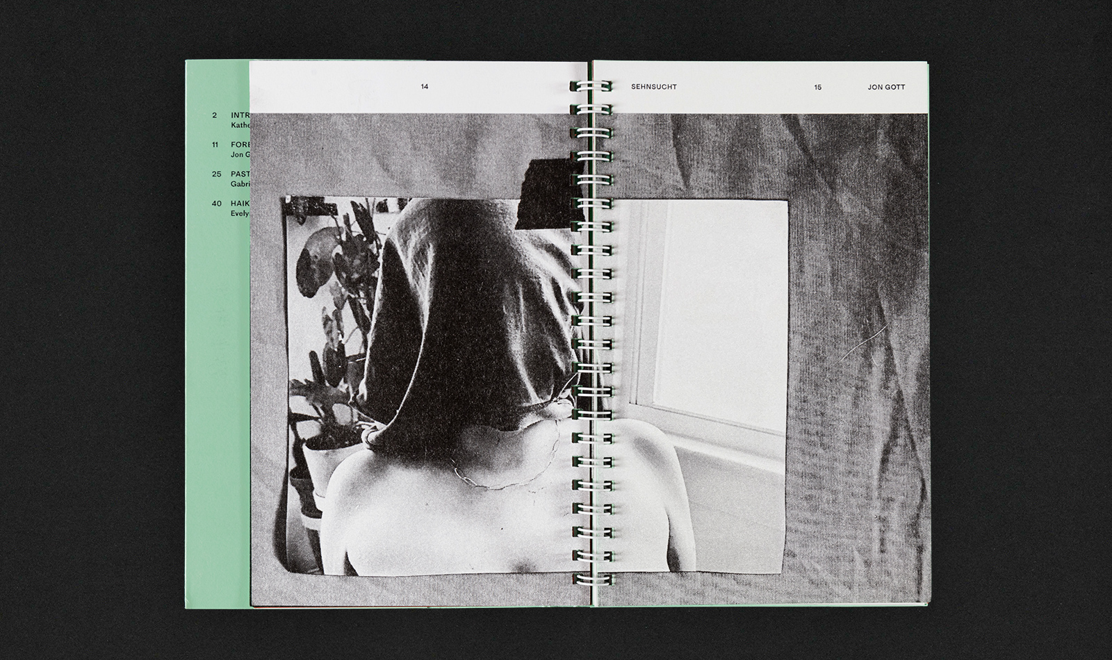
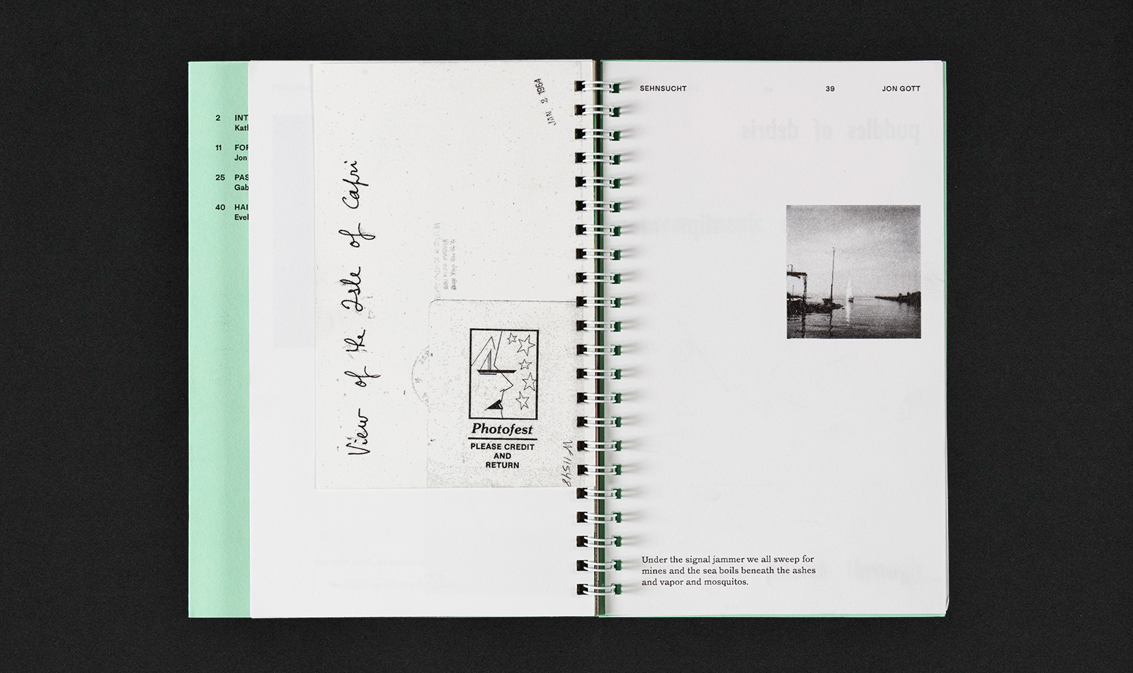
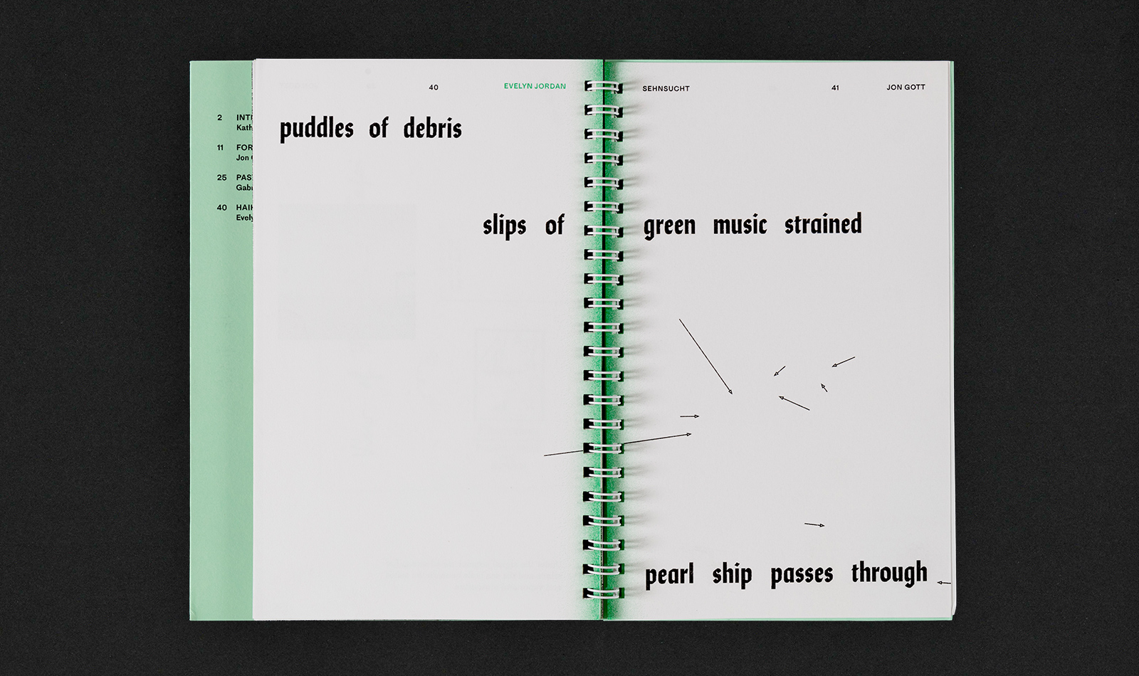
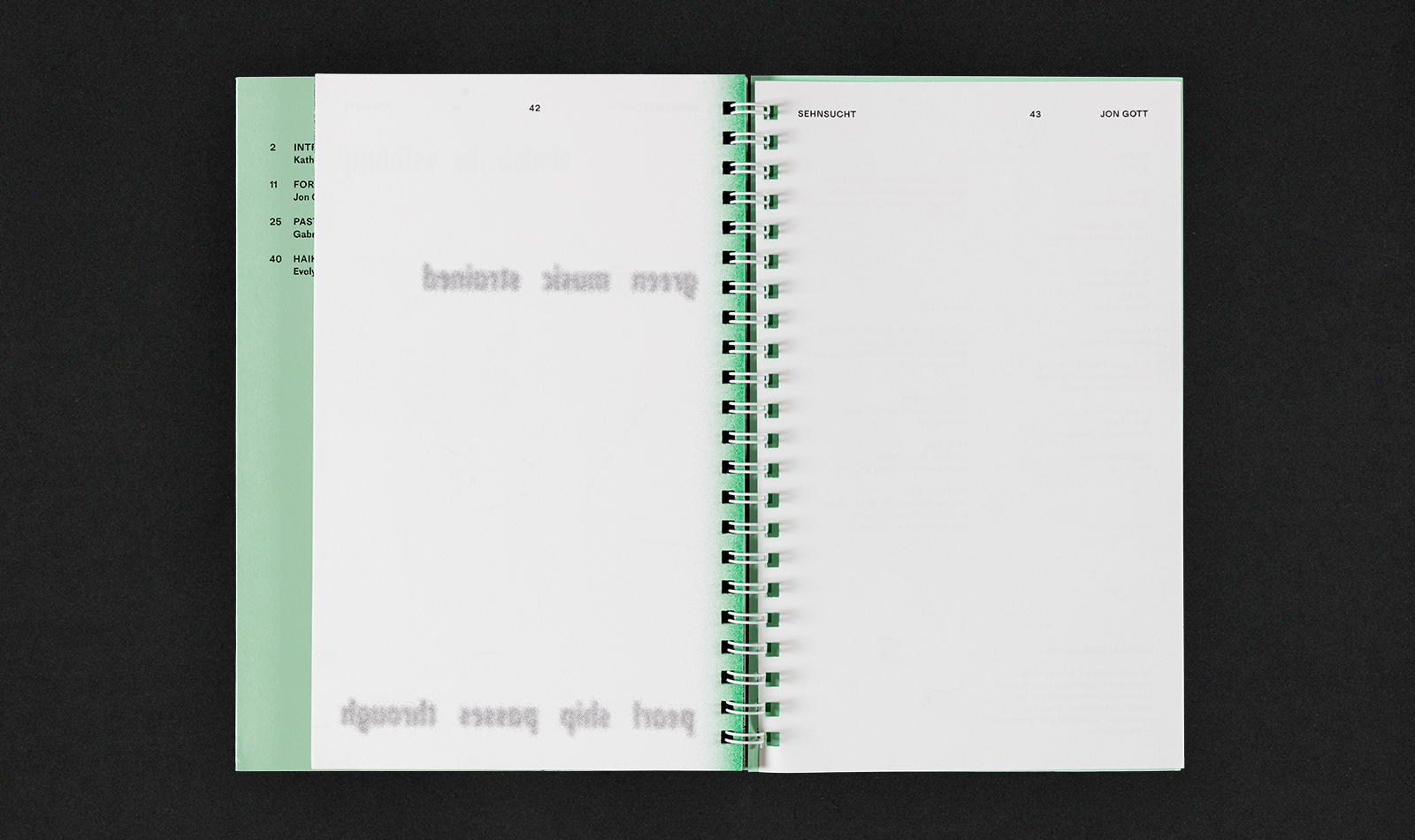
Luckily, Jon Gott allowed me to take the reins and compose as I wished, creating a narrative through a large folder of image assets. I set out to lay it out as I read his imagery—playing with full image presentation, overlay, zoomed crop, scale, blur, design as ephemera, etc—all the while leaving space for text that would eventually weave it all together.
Upon presentation, he felt it was the correct ‘order,’ pacing, and somehow captured the feeling as he had intended in his mind. However, I wonder if I could have taken any number of design pathways and it would have satisfied the visual mapping his mind, so to speak, but maybe it is best to not know.